
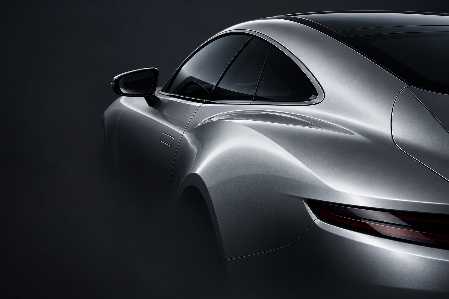
Product name under NDAThe largest luxury car marketplace in the US
- What
- Marketplace for luxury and collector cars, including rare hypercars
- Where
- USA · in-house product team
- Role
- New interface architecture and page layouts for the redesign
We design and build websites around your business, your brand and the people you need to reach.
A pointof view.
Visual language.
Shaped around your brand.
Through analyses, researches, prototyping and visual concept creation, we turn complex requirements into a clear structure, a distinctive visual language and a carefully built website.
A website needs to explain your product, express the character of your brand and help people decide what to do next. We establish those priorities early and use them to guide the structure, content, visual direction and interactions.
Our work connects business understanding, design and development. The reasoning behind a decision carries through from the first prototype to the way the finished website behaves.
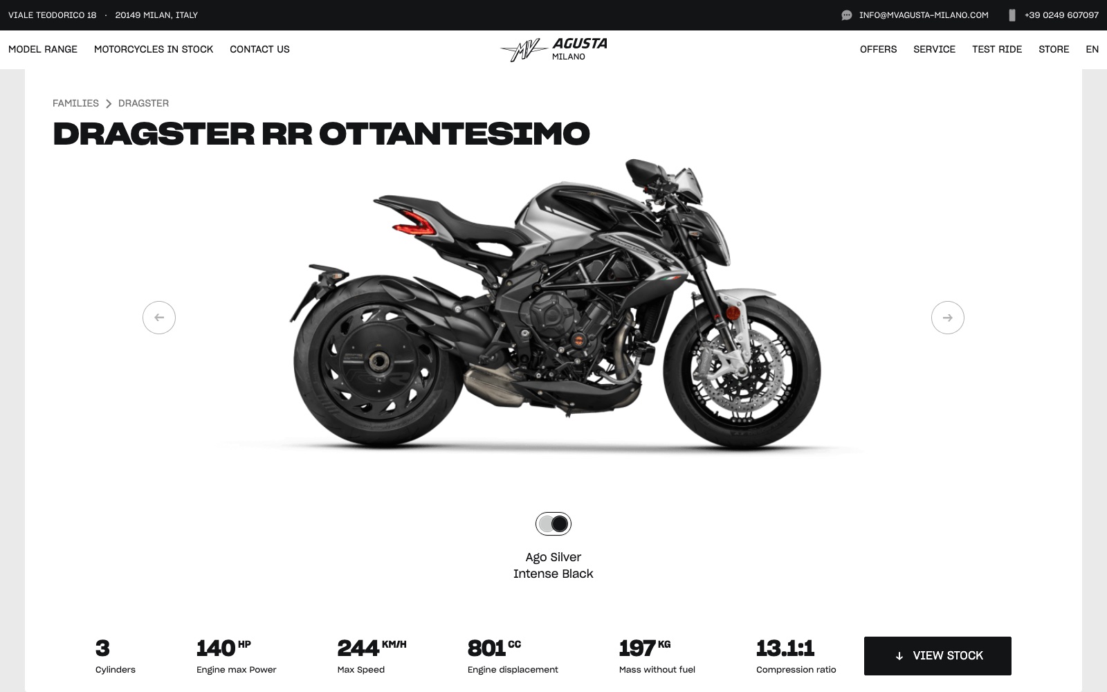
UX/UI design for a motorcycle dealer website, connecting model families, detailed product pages, available motorcycles and enquiry journeys. The project brings expressive automotive imagery together with the practical information people need to explore and compare motorcycles.
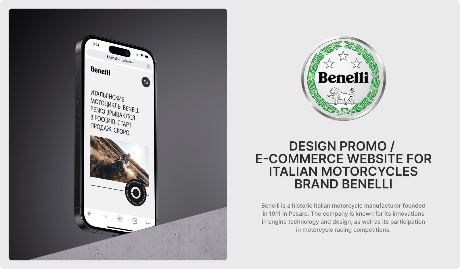
Promotional and e-commerce website
A website created for the Moto Springs 2022 exhibition, combining motorcycle presentation with e-commerce pages. The project covers visual direction, interface design and website implementation.
Each stage produces decisions and materials that inform the next. We agree on the scope, review key decisions together and revisit assumptions when the work reveals something new.
We examine the business, product, audience and competitive context to establish what the website needs to achieve. We identify the questions that matter, then define a research plan around them.
Depending on the project, this can include:
We bring the findings together into a project brief, priorities and hypotheses that guide design decisions.
We define the messages the website needs to communicate and the information people need to make a decision. From there, we develop the sitemap, content hierarchy, user flows and page prototypes.
Prototyping lets us examine the sequence of information and the logic of important interactions. We review key journeys and use appropriate testing to resolve questions before detailed design.
The outcome is a content and structural foundation for the website, with the main scenarios worked through.
We explore how the brand should look, feel and behave online. Typography, composition, imagery, colour and motion form a visual direction grounded in the project brief.
We demonstrate the direction on representative pages and interactions, explain the reasoning behind it and refine the selected concept with your team.
The outcome is an agreed visual language that can carry across the website.
We bring the structure, content and visual direction together in the final page designs. This is where the concept develops into a complete website, with responsive layouts, reusable components and interaction states.
We work through real content, different screen sizes and the details of important journeys. The component system is developed to match the scale of the project and support future additions.
The outcome is a coherent design ready for development.
We build the pages, interactions, content management and agreed integrations. Design review continues throughout development so that typography, layout, motion and behaviour retain their intended quality in the working website.
We test critical journeys, forms, responsive behaviour, accessibility and performance across the agreed browsers and devices.
The outcome is a working website prepared for launch.
We coordinate the release, verify the website on its live domain and check that key journeys and agreed analytics events work correctly. For a redesign, we plan the transition from existing pages and URLs.
The success criteria established during analyses guide what we measure. We provide the agreed handover materials and monitor the initial release.
The outcome is a live website with the measurement needed to inform its next steps.
Additional iterations are available after launch. We review user feedback and available behavioural data, prioritise opportunities and agree on the next improvements.
Each cycle can address content, navigation, interactions, new pages or functionality. Changes are evaluated against the project's goals and the evidence available.
The scope and cadence of this work are agreed separately.
The quality of a website shows in how its parts work together: the order of information, the relationship between pages, the consistency of its components and the way it responds to a person's actions.
We carry those decisions through content, design and implementation. Mobile layouts receive the same attention as desktop pages. Forms include feedback and error states. Motion has a purpose. New content has a place within the system.
Share your company, what is changing, and what the website needs to achieve. Choose a project brief below, or use the short form on the rightbelow. We’ll reply by email with the next step.
© 2026 SKARR.PRO