
Healthcare App
Product UX
Automotive · Website
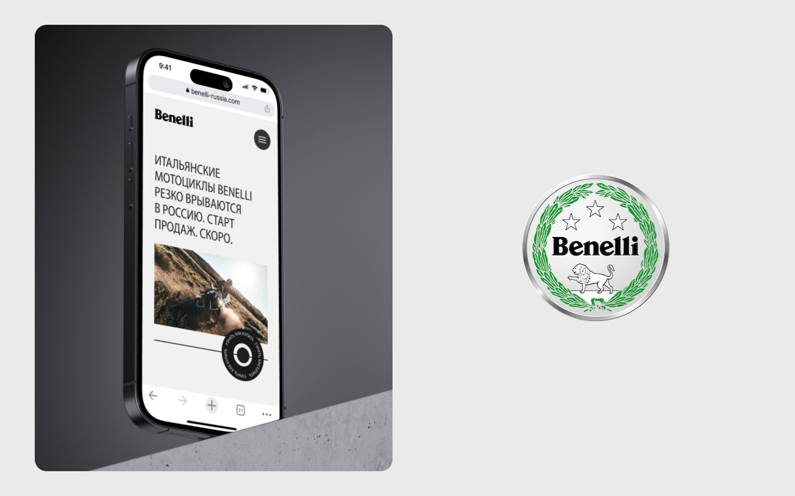
A website introducing Benelli’s motorcycles to a new market: a bold first impression, a model line-up to explore and a way to register interest before sales began.
The request arrived ten days before the Moto Springs 2022 exhibition. The site needed to introduce Benelli and its motorcycle line-up, give each model a clear presentation and collect enquiries while sales were still to come.
We took the project from concept to the Tilda build and final design review. That included mood boards, page design, processing the supplied photography and adapting the site for five screen sizes.
We chose large capitals, black blocks and generous space around the motorcycles to give the launch a direct, confident voice. Several versions of the main screen and key pages were presented before the direction was approved.
We established the desktop design in Figma, then adapted four further screen sizes directly in Tilda. This kept the visual decisions in one direction while reducing the amount of separate layout work.
01 / From interest to enquiry
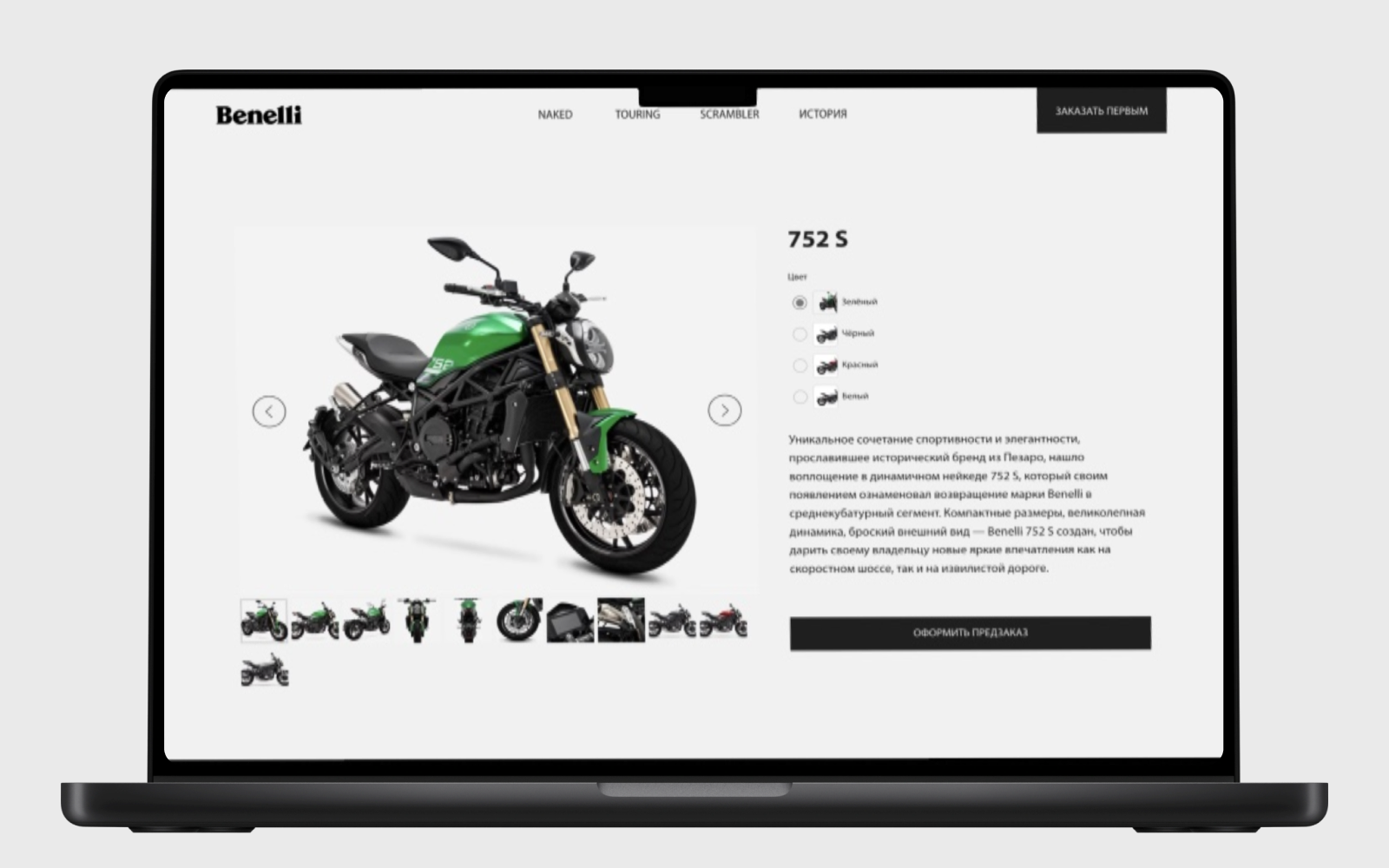
The model page moves from the launch announcement to a closer look at the bike. We paired a large photo gallery with colour choices and a concise description, keeping the motorcycle itself at the centre of the page.
At this stage, the next step was an enquiry. The order buttons opened a short contact form so visitors could leave their details and hear how to buy. This matched the site’s pre-sales purpose.
The result
The finished site covered the motorcycle line-up, individual models, brand history and enquiry forms across five screen sizes. The domain has since been redesigned; these portfolio frames preserve the original work.
© 2026 SKARR.PRO
Categories
Choose your language