
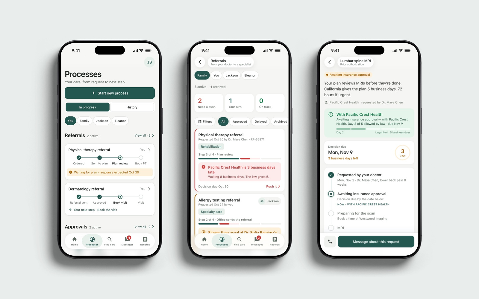
Healthcare App
Product UX
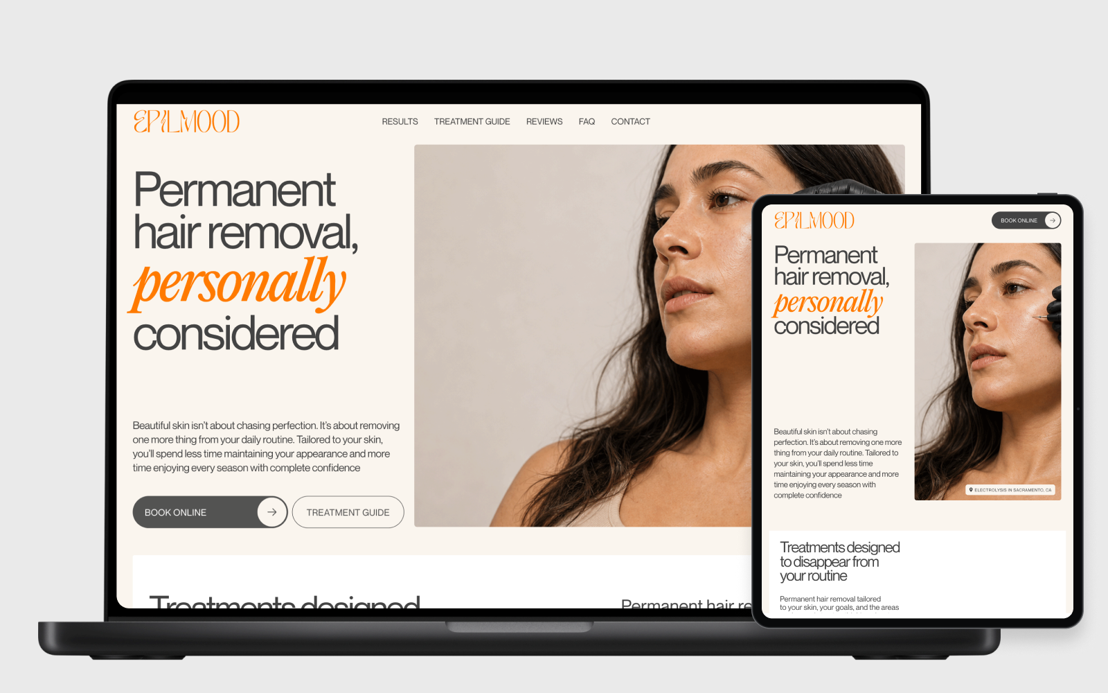
Electrolysis studio · Website
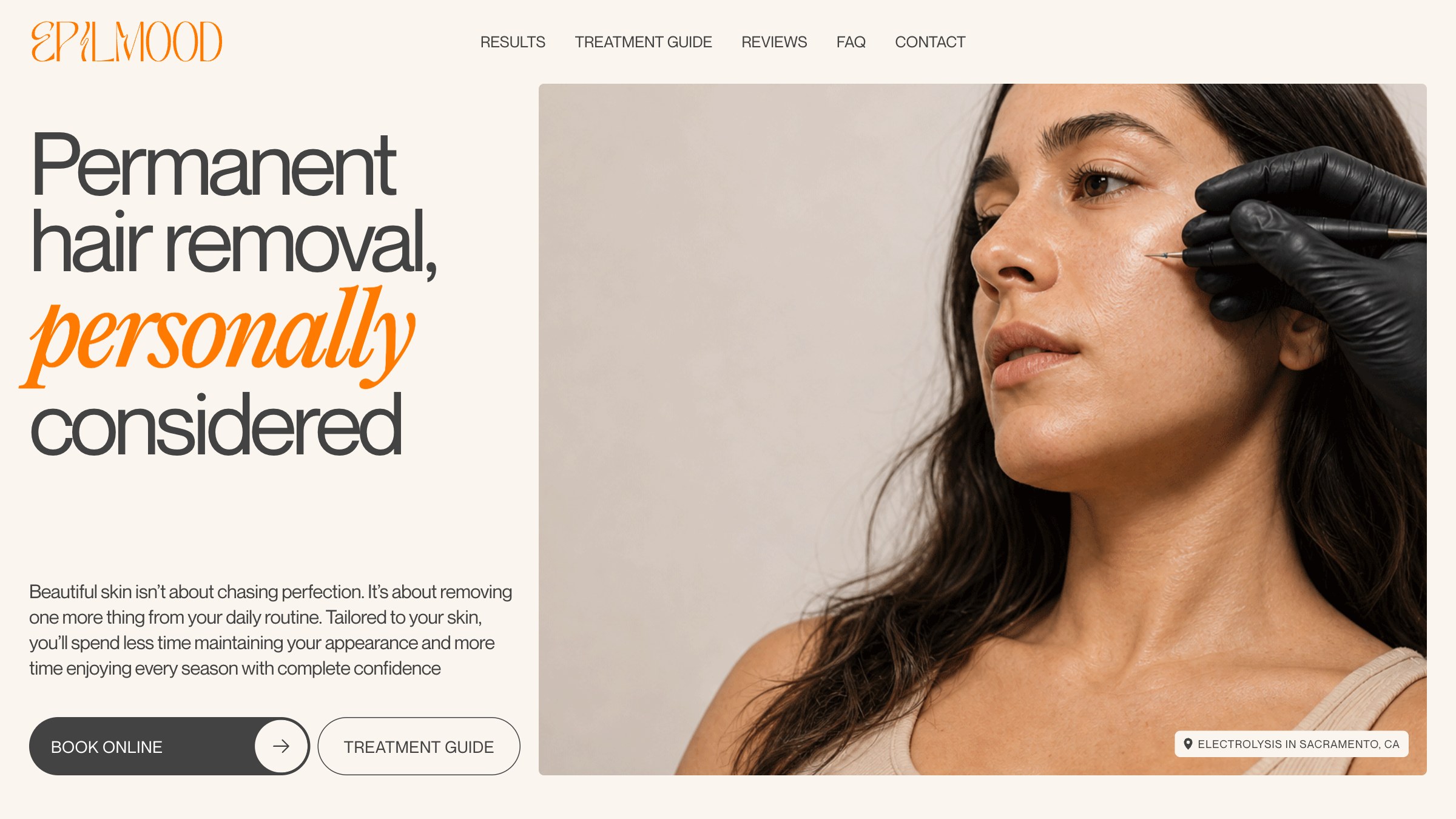
A website for an electrolysis studio in Sacramento, built around a personal introduction and clear guidance. Editorial design and a considered content hierarchy help visitors find a relevant starting point and keep practical answers close at hand.
We designed for someone considering where to book and whom to trust. The site needed to express the studio’s character and introduce its founder, while still making preparation, aftercare and other treatment information easy to find.
We shaped the website structure, wrote the headlines and connecting narrative, and carried the visual design and motion into a React build. The client’s own preparation, aftercare and audience texts remained in her words.
Our central decision was to give each screen one clear idea. Large statements establish the story; short explanations, disclosures and dedicated pages carry the detail. This gives the studio a recognisable voice without asking every visitor to read everything.
The website brings together the founder’s introduction, a treatment guide and five audience pages. The structure supports both a quick first impression and a more detailed read before booking.
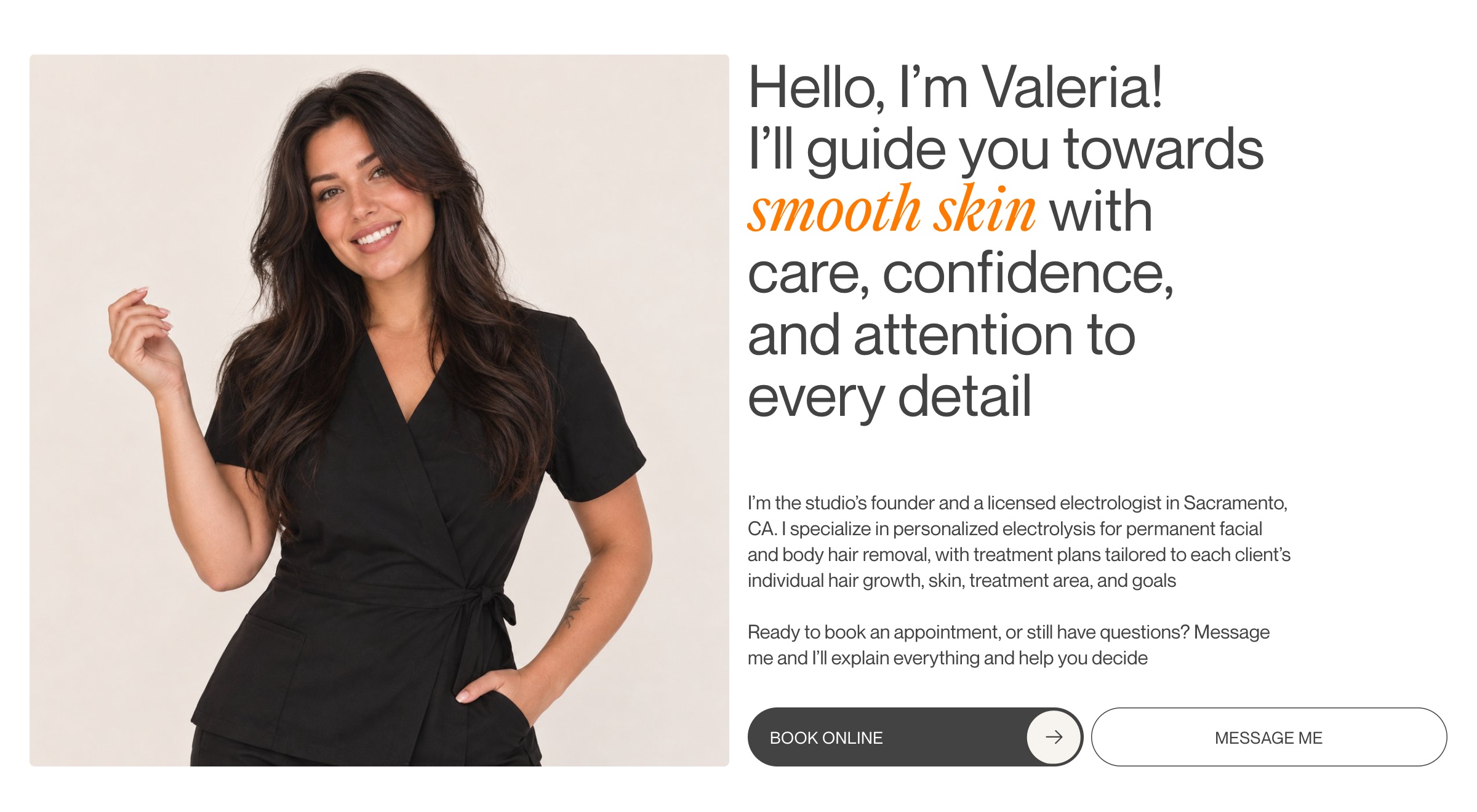
01 / The person behind the studio
A treatment website asks visitors to trust a person. We gave the specialist a substantial introduction, with a portrait and first-person voice alongside direct ways to book or send a message.
The layout makes that introduction part of choosing the studio. The portfolio version uses an illustrative portrait and name.
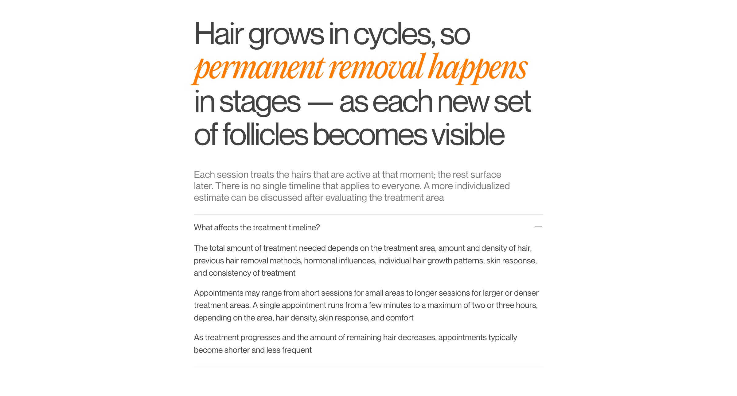
02 / Reading at different depths
We organised the content into three levels: a large statement, a short explanation and detail that opens when needed. The same hierarchy carries through the typography, spacing and disclosures.
The orange italic marks a meaningful turn in a sentence. Supporting information stays quieter, so the page has a clear reading order even when there is a lot to explain.
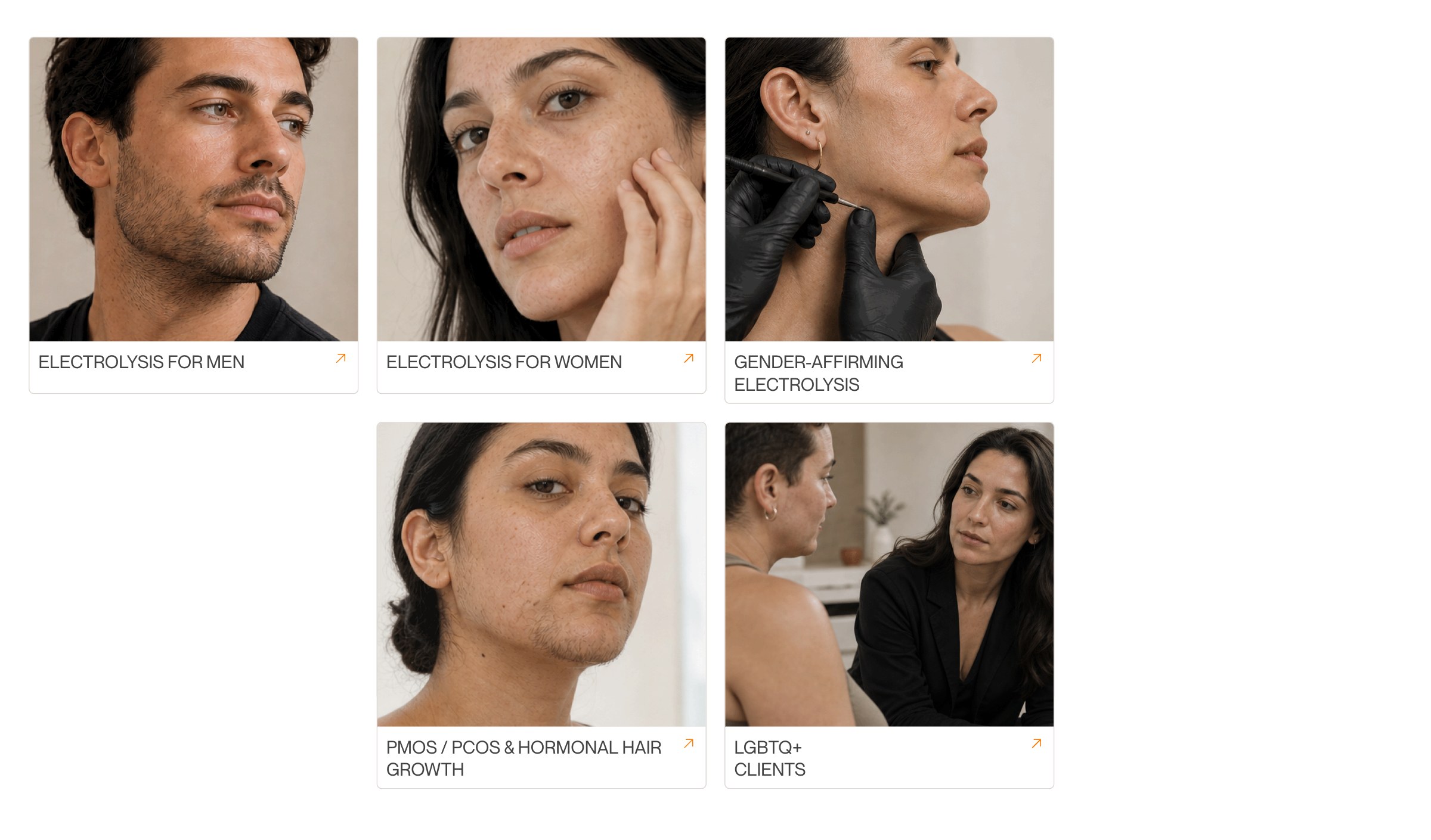
03 / Relevant starting points
Different visitors arrive with different questions. We gave five audiences distinct entry points, including men, women, people with hormonal hair growth, LGBTQ+ visitors and those considering gender-affirming care.
Each card leads to a dedicated page using the client’s own text. This lets the home page stay concise while giving more specific concerns room to be addressed.
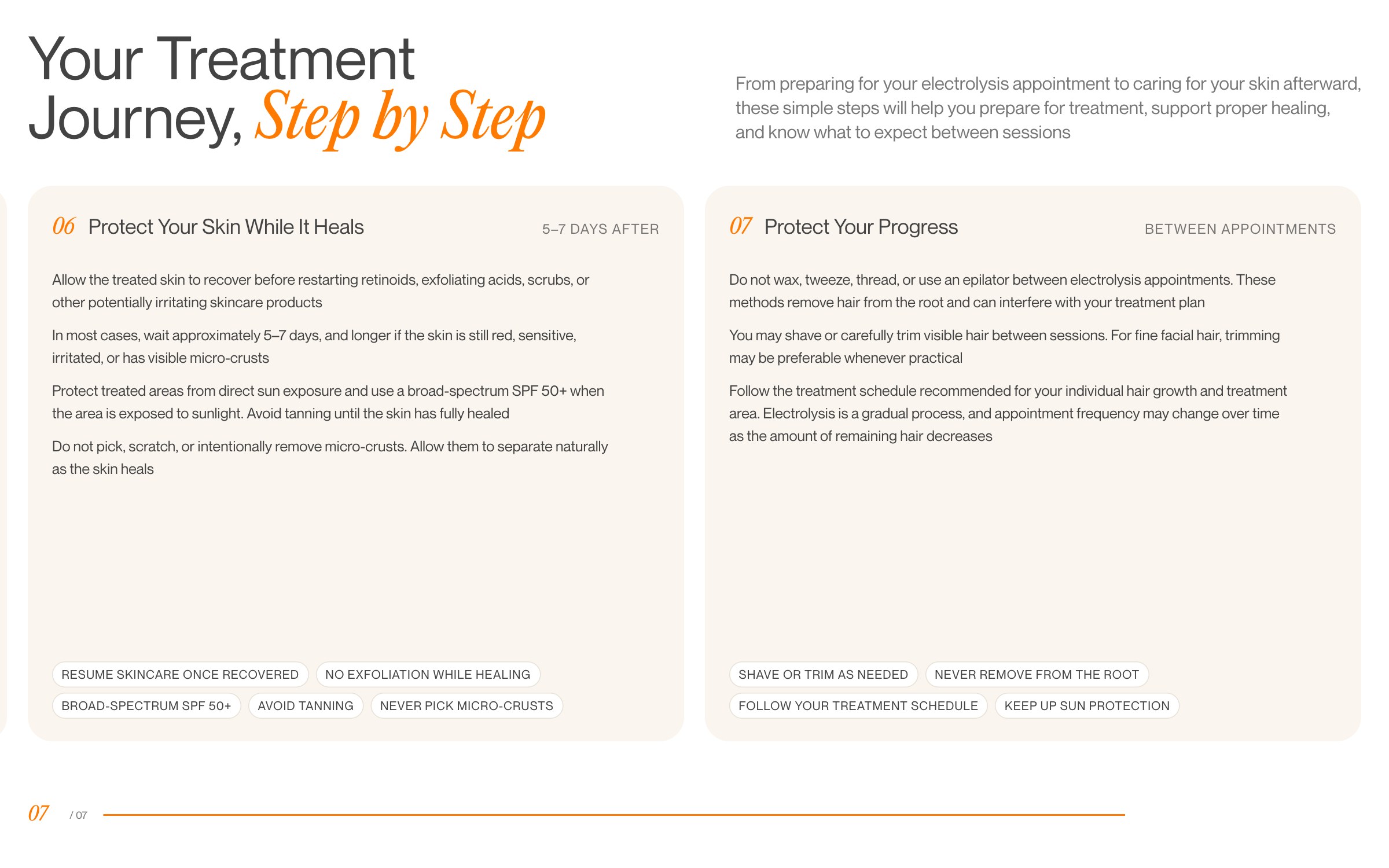
04 / Practical information
Practical guidance works best when readers know where they are in the process. We arranged the treatment journey as seven steps, from preparation through the visit and aftercare.
The numbered sequence gives the client’s information a clear place in the experience and a route back when a visitor needs to check it again.
The site
The website brings together the visual direction, written narrative, founder’s introduction, five audience pages and treatment guidance in a responsive React build.
© 2026 SKARR.PRO
Categories
Choose your language