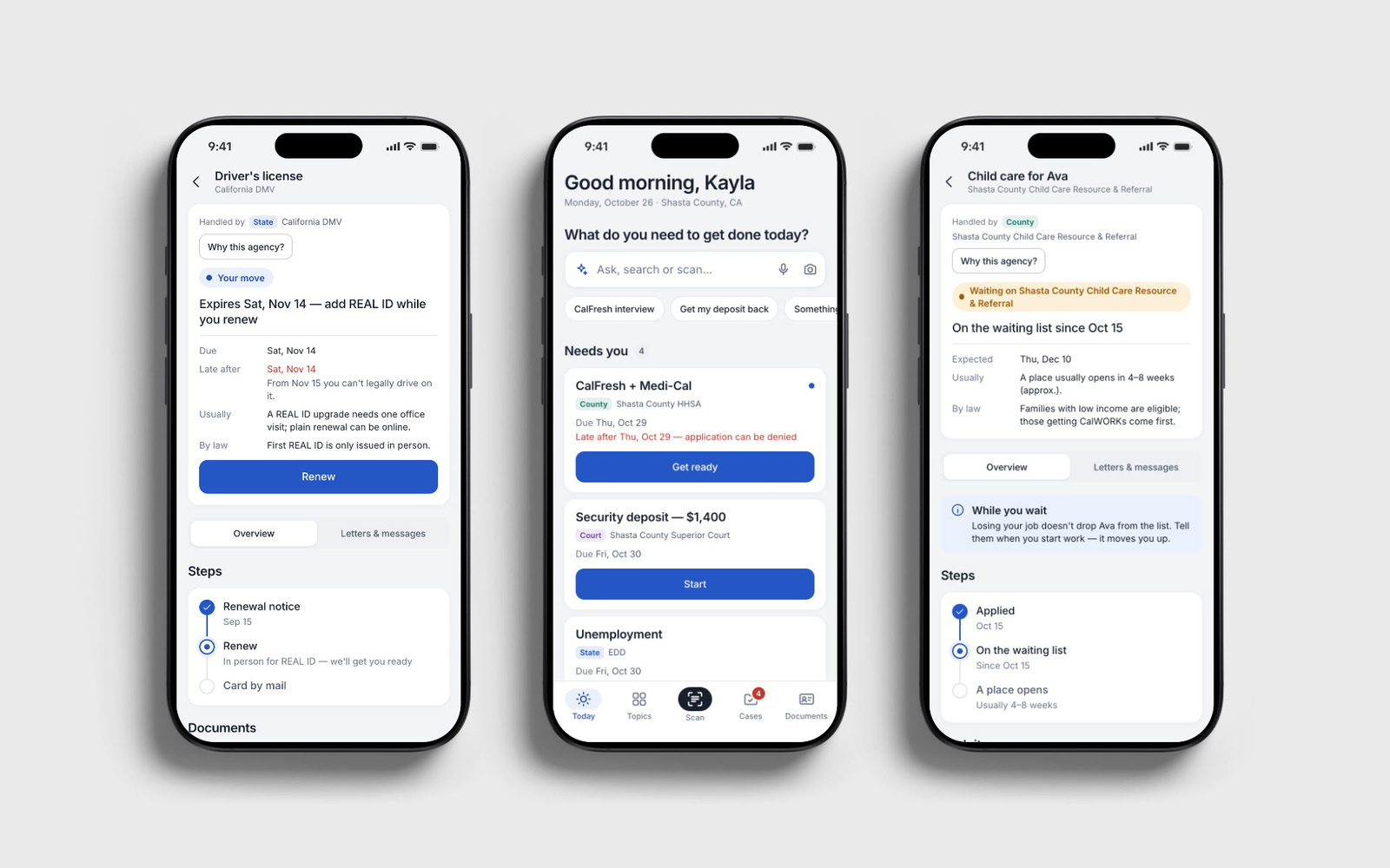

Healthcare App
Product UX
Beauty · Website
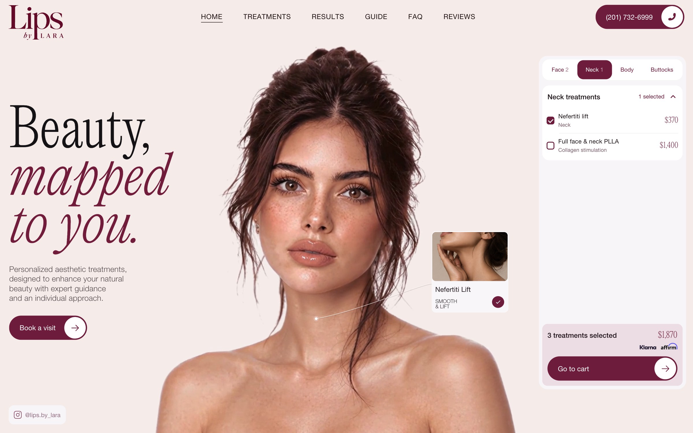
A website for Lara’s aesthetic practice, bringing together an expressive visual design, an animated character and a treatment builder. Visitors can explore areas, see prices openly and assemble a plan to discuss with Lara.
Lara was answering the same questions in direct messages and wanted prices available without a separate enquiry. We developed a website that could introduce her practice, make a detailed treatment list approachable and give those recurring answers a permanent home.
We shaped the content and website structure, designed the visual language, created the AI-generated character and her animation, and built the responsive site and checkout. The work connected art direction, motion and the mechanics of choosing treatments.
We organised the treatment list by area and designed the character, cards and plan as one experience. Alongside it, we developed dedicated prices, preparation, aftercare and FAQ pages that Lara can link to directly.
We built the visual direction around expressive serif typography, a soft blush field and burgundy accents. A large portrait anchors the opening composition, with generous space and carefully placed treatment cards around her. The builder belongs to that composition from the start: its panels, prices and controls use the same visual language, carrying the website’s character into the practical parts of the experience.
01 / Character and motion
Creating the character meant developing both her appearance and her movement. We generated the model and animation, selected consistent sequences and built a long loop so a short gesture would not repeat every few seconds.
Movement also had to work with the interface. Transitions were built around chosen points in the loop, and the treatment cards follow their areas as she moves. This short extract shows the character and cards together in the finished scene.
02 / Treatment builder
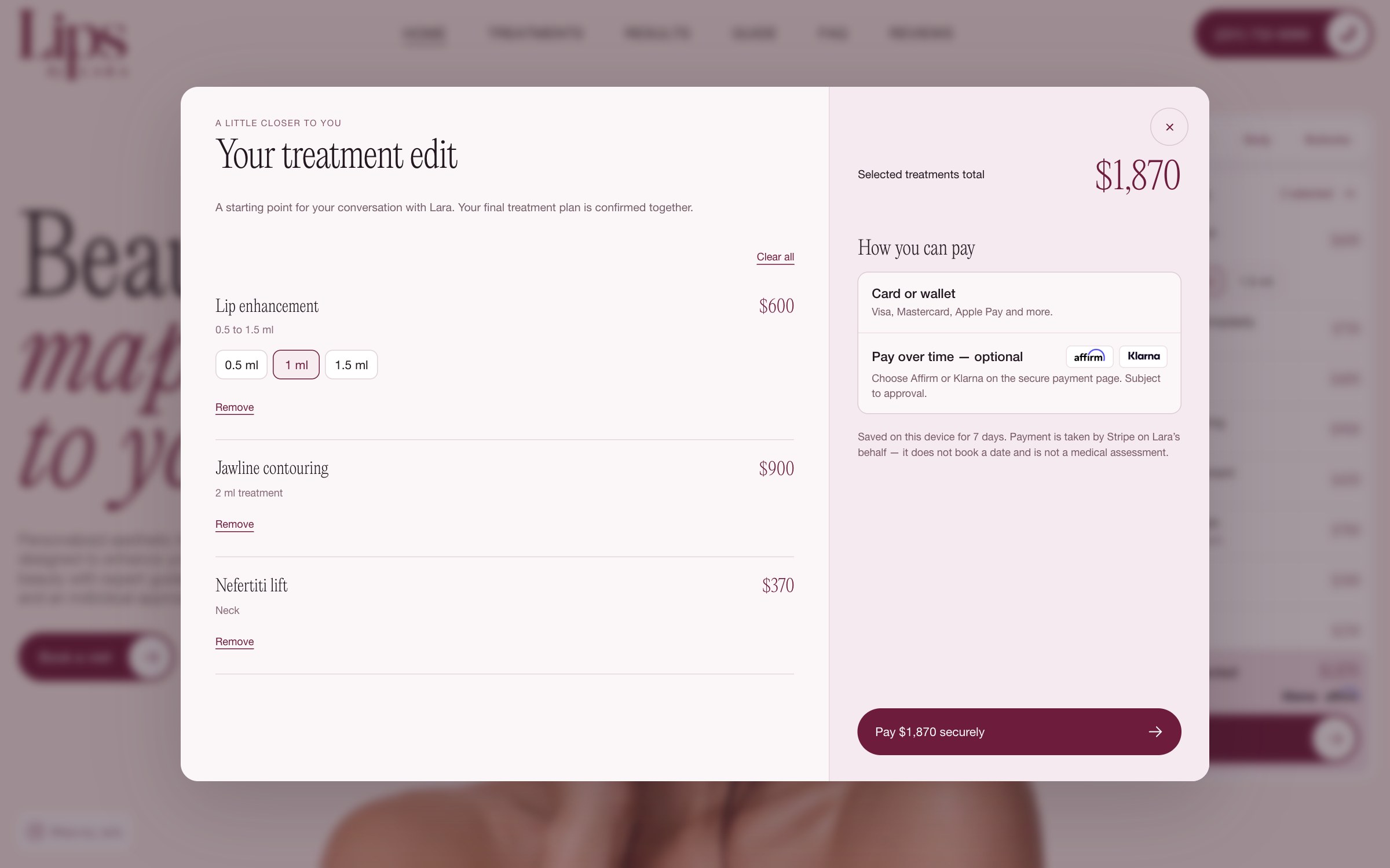
Lara’s price list contained more than 40 items organised by treatment type. We regrouped it by area, so someone exploring a part of the face or body could see the relevant choices and prices together.
Changing the area updates the scene and treatment list while retaining previous selections. Adding a treatment connects its card, selected state, item count and total. In the opening frame, two face treatments stay selected when a neck treatment is added; all three appear together in the cart.
We connected checkout to Lara’s own Stripe account and made the next step explicit: the plan starts a conversation, and payment does not reserve an appointment or replace Lara’s assessment.
03 / Content and guidance
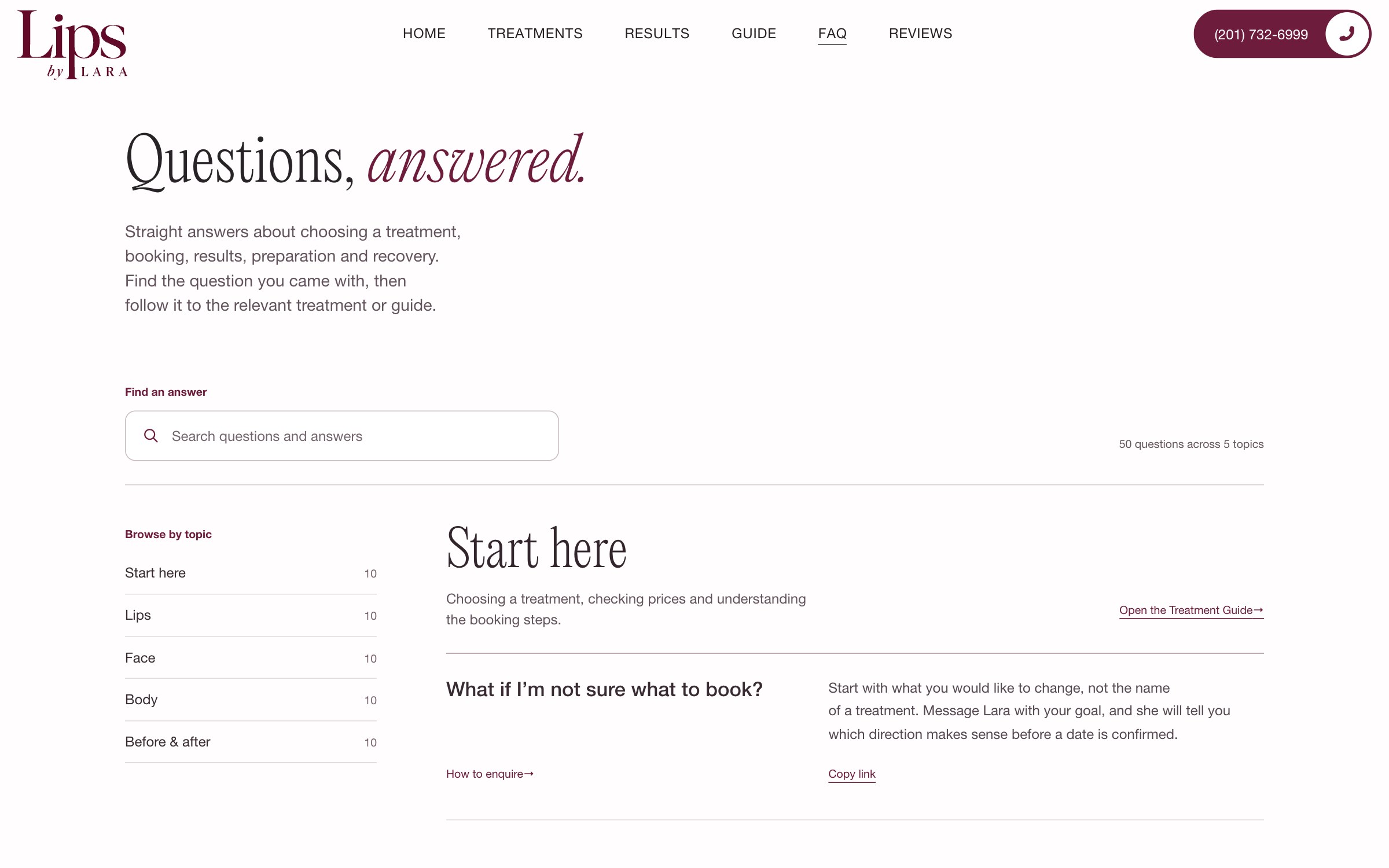
We reviewed published questions from other injector websites and used a structured brief to gather Lara’s own answers. That work became a searchable FAQ with 50 questions across five topics, alongside preparation and aftercare guidance.
Each answer has its own link. Lara can send the relevant explanation in a message, and visitors can return to it without searching through an old conversation. The reference pages carry the same visual language as the home page.
The result
The launched site combines a custom visual design, generated character animation, a connected treatment builder, practical guidance and Stripe checkout, with layouts for desktop, tablet and phone.
© 2026 SKARR.PRO
Categories
Choose your language