
Healthcare App
Product UX
Automotive · Dealer website design
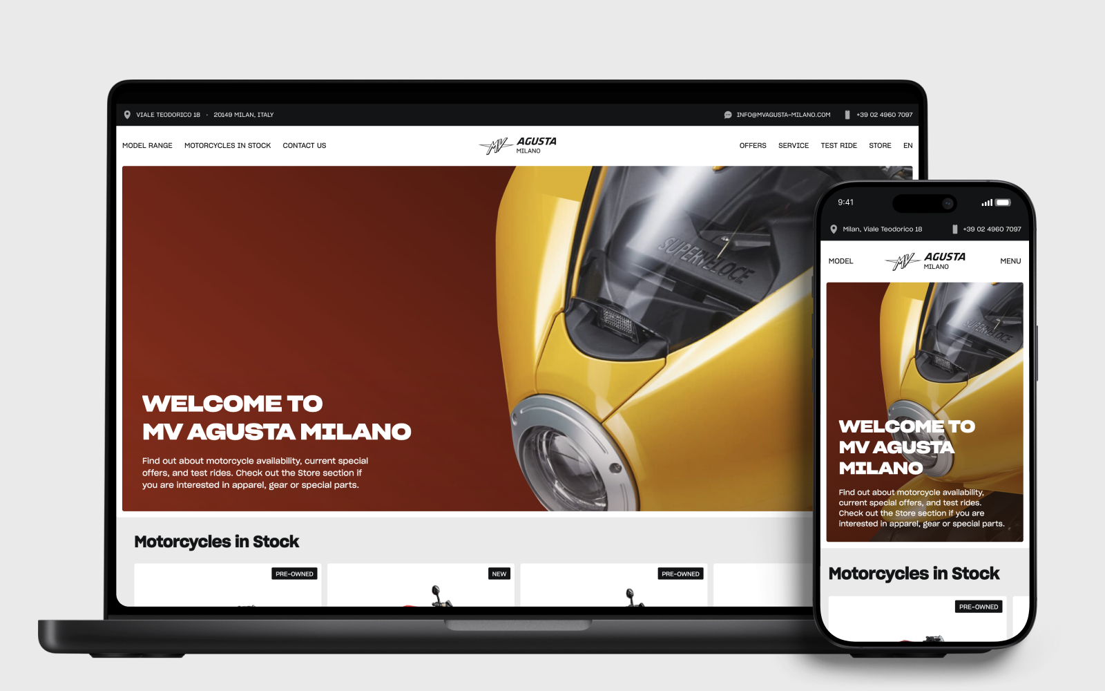
A commissioned website design for an MV Agusta dealer, later built in-house into a working showroom. The experience carries the brand’s visual character through model discovery, stock selection and contact with the dealership.
Automotive · Digital product
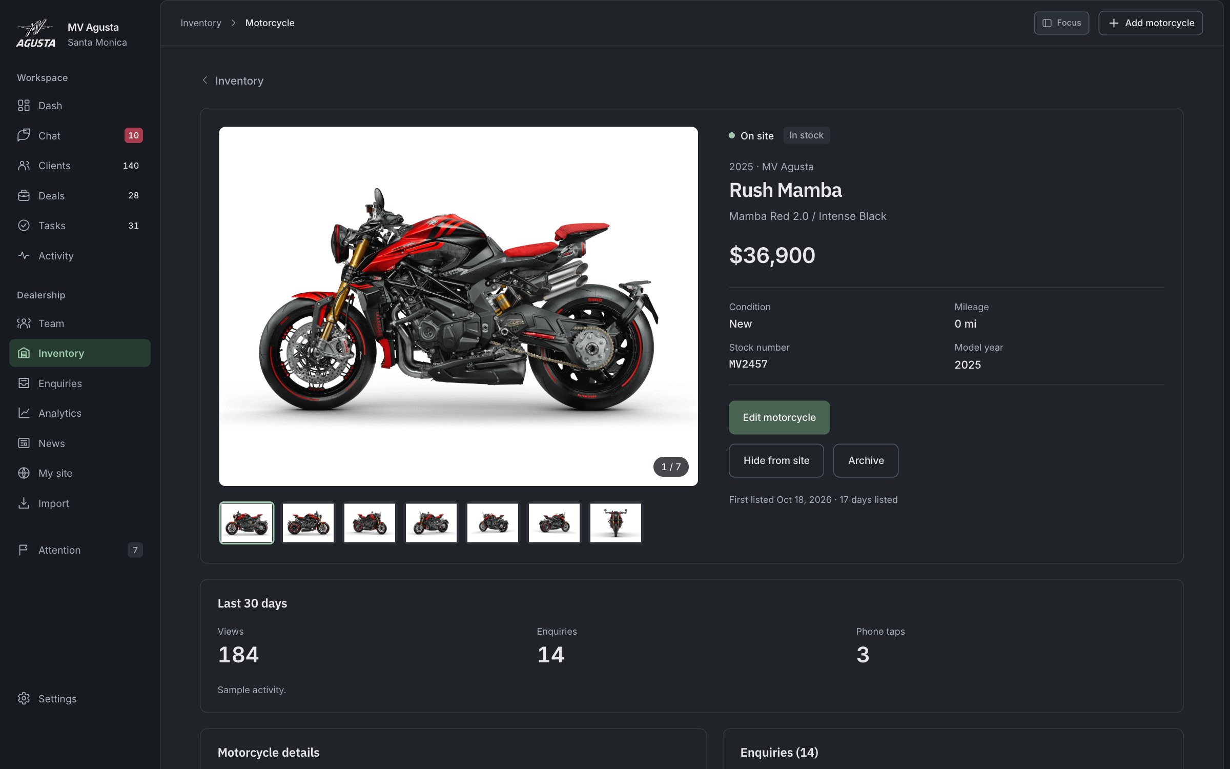
A workspace for motorcycle dealers to answer customers, arrange visits and move sales forward. Email, SMS and website conversations come together in one place, with clear customer responsibility and the motorcycle and next step close at hand.
The website helps buyers find a motorcycle and make an inquiry. The workspace is designed to carry that context into the dealership’s daily work. These demos run separately; their connection is not live.
Adapt the brand’s editorial visual language to a dealer’s website. Buyers needed to see what was available, compare the details of a particular motorcycle and find a clear next step with the dealership.
A buyer may email about a motorcycle, continue by text and then ask to visit. The dealer needs to keep that conversation together, know which manager looks after the customer and turn their interest into a clear next step. We set out to make replying, arranging a visit and following up part of one continuous workflow.
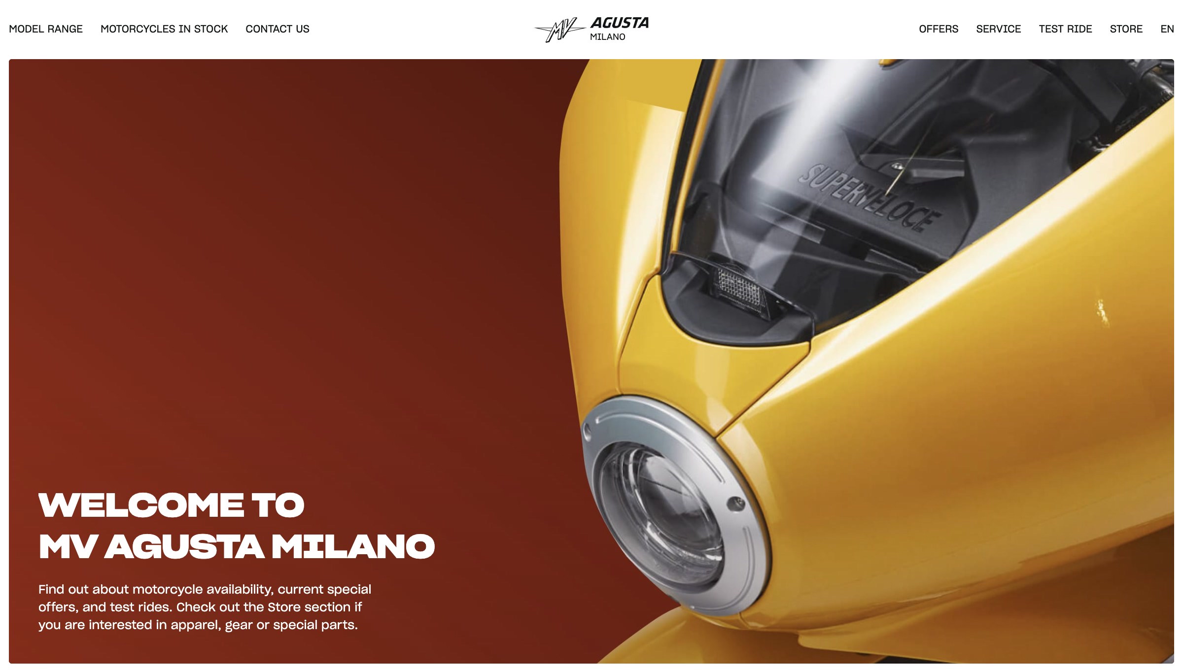
Starting from a supplied structural brief, we reworked the visual style, composition, components and parts of the page order. Large photography establishes the brand; stock cards, specifications and direct actions support the buying journey.
After delivering the design, we built it into a working website ourselves. Shared page patterns carry the same navigation, model presentation and stock selection across the showroom.
We put the customer conversation at the center. Messages keep their channel visible, and staff can choose how to reply from the same place. We linked conversations to the customer record, where the assigned manager and motorcycles of interest stay clear.
We connected the conversation to the visit: staff offer showroom times, and the buyer chooses online. Deals and tasks carry the next action forward. Each motorcycle has its own stock record, and a separate publishing step gives the dealer control over what buyers see on the website.
We delivered the UX/UI design and reusable components, then developed the showroom frontend and motion as a studio project. The brand identity and motorcycle imagery are MV Agusta’s.
We shaped the product direction, mapped the relationships and workflows, reviewed the first version section by section, and designed and built the responsive frontend. The work covers both the interface people see and the rules that make its sections work together.
01 / Dealer priorities
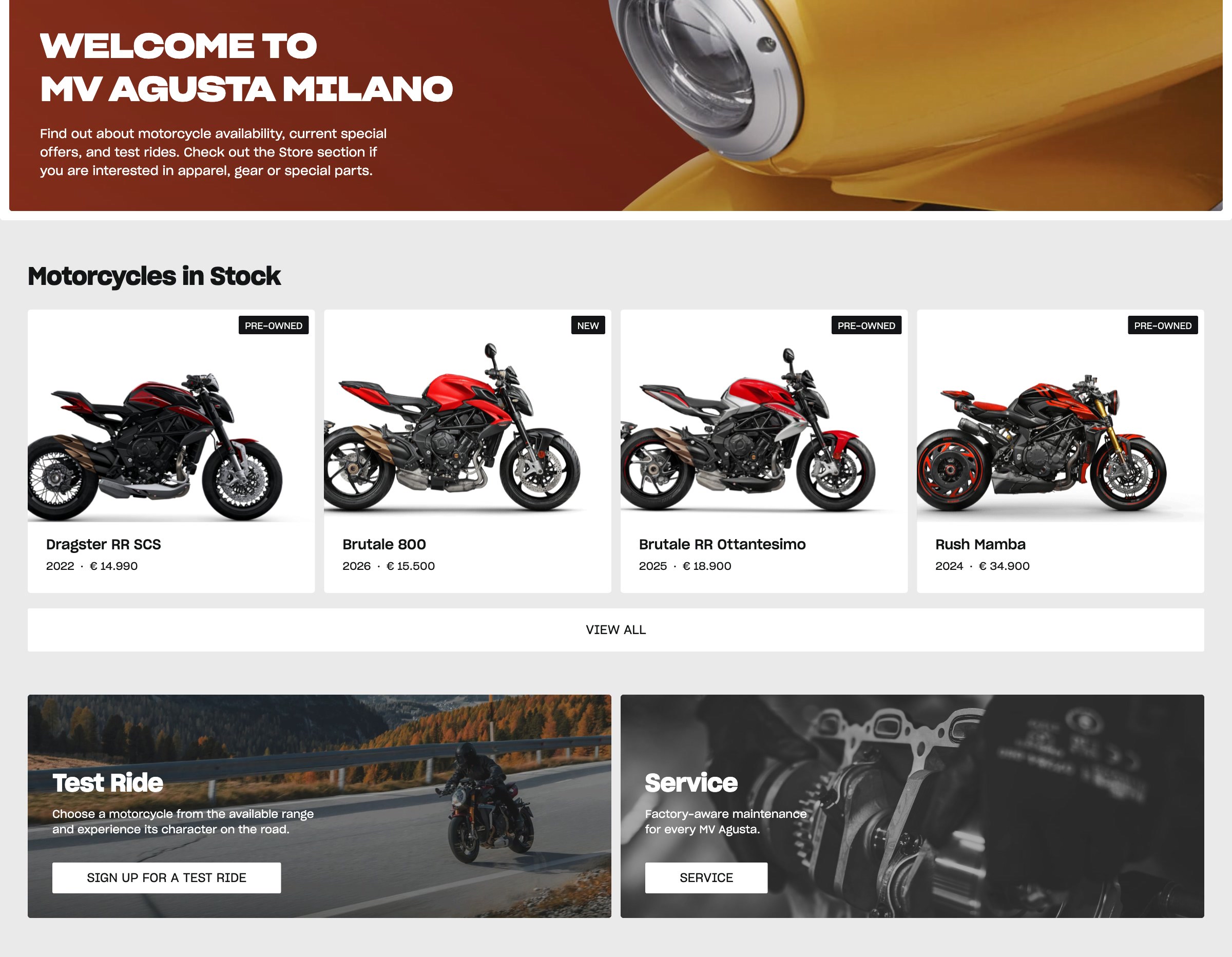
The home page brings stock immediately after the opening image. Condition, year and price are visible together, so the first decision can be about a motorcycle the dealer has to offer.
Test rides and service follow as direct actions. These are the dealership’s everyday reasons for a visit, and they have a clear place in the page hierarchy.
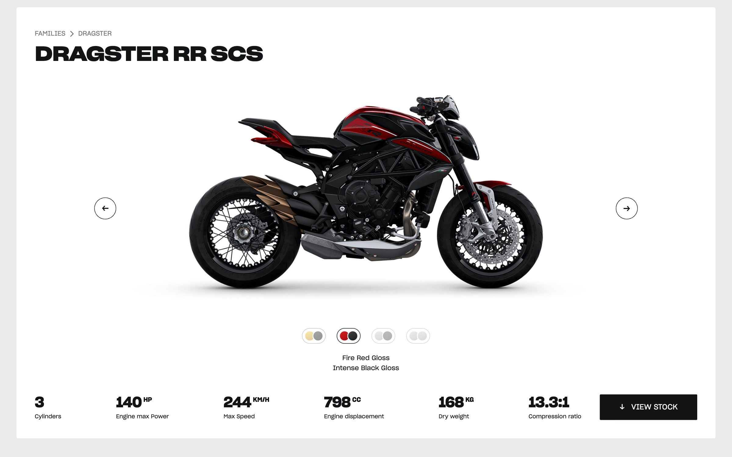
02 / Model exploration
We brought the motorcycle, available views, key specifications and View stock into one consistent product card. Buyers can inspect the model while its practical details stay in place.
View stock carries the selected model into the inventory filter. This connects the expressive model page to the dealer’s available motorcycles.
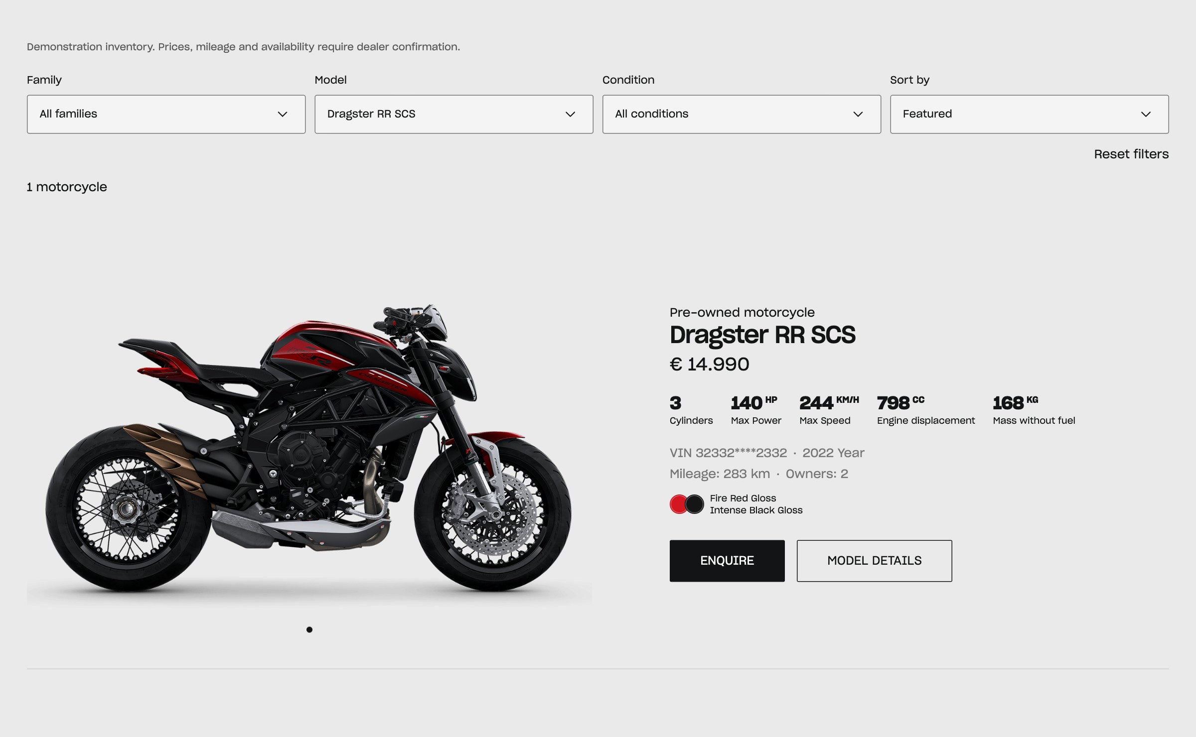
03 / Stock selection
A stock listing needs more than a model name. We placed the asking price, year, mileage, previous owners and part of the VIN beside the motorcycle, with an Enquire action.
Family, model and condition filters narrow the list; sorting supports price and year comparisons. The filtered view keeps its selection in the URL, so it can be shared. The stock shown here is sample data.
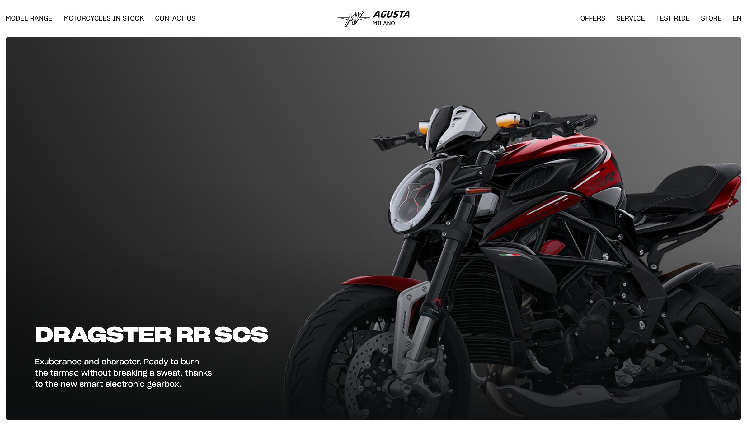
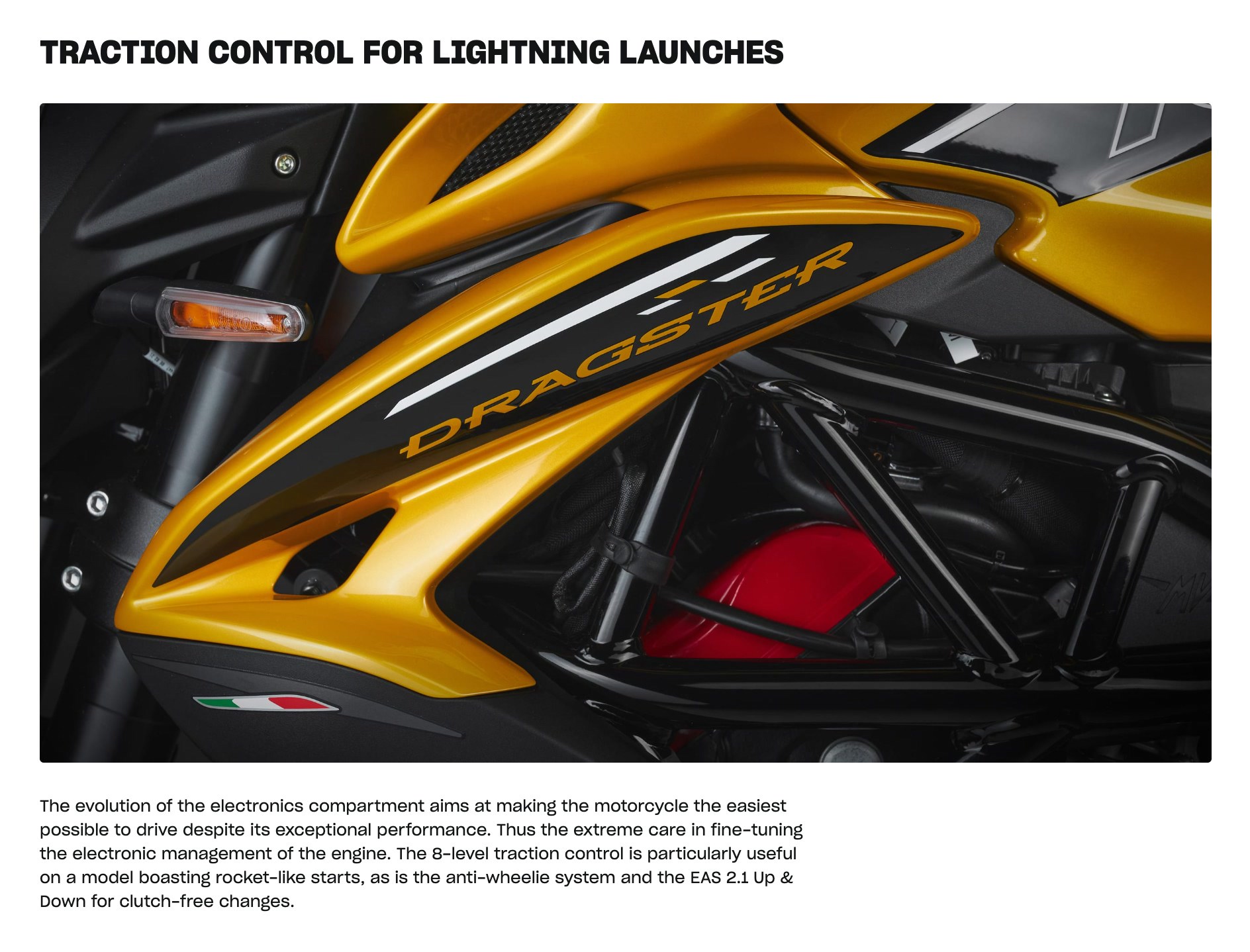
04 / Visual direction
Large motorcycle imagery, strong typography and light–dark contrast keep the showroom recognizably MV Agusta. We used the brand’s photographs within a new composition and component system.
The model page gives technical detail its own visual rhythm: a close-up, a clear heading and a short explanation. Motion follows that hierarchy, with an expressive opening and quieter transitions through the details.
01 / Customer conversations
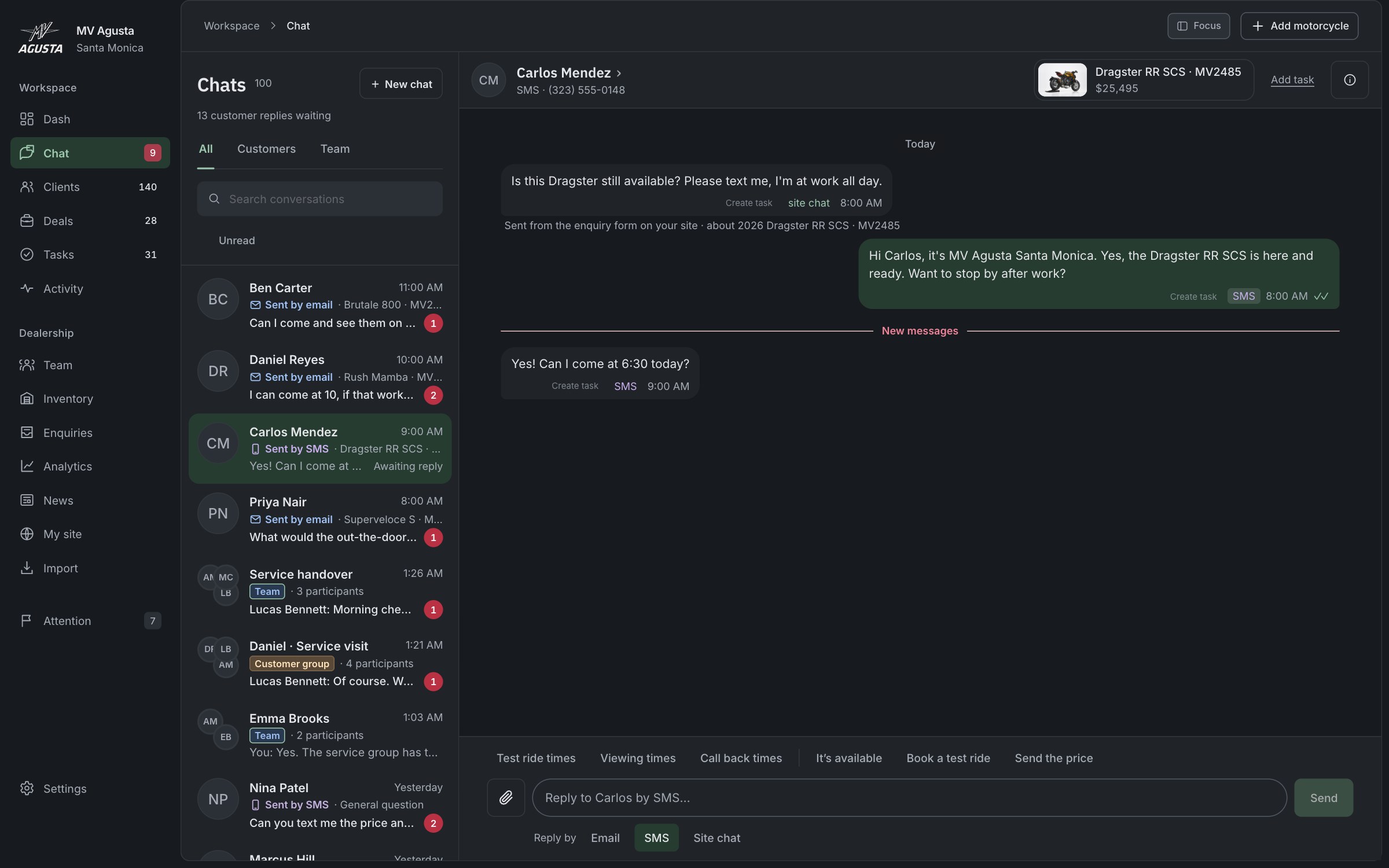
A customer can start on the website and continue by text. Staff need the earlier exchange in view when they reply, whichever channel the buyer uses.
We brought website inquiries, email and SMS into the same chat interface, with the channel shown on each message. In this sample, Carlos moves from the website to SMS; staff can reply beside the conversation history, with the relevant motorcycle above it.
02 / Customer responsibility
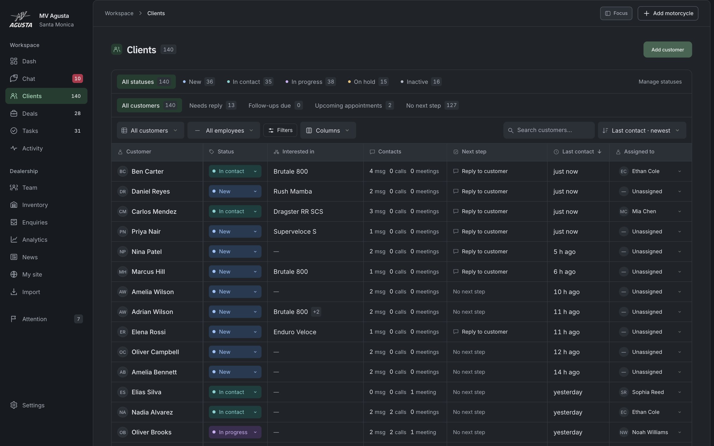
A shared dealership contact needs clear responsibility behind it. The team can assign a manager to a customer and see who is handling the relationship, alongside the next action.
We attached that responsibility to the customer record. When contact details identify an existing customer, a new inquiry links back to that record and keeps the assigned manager. Conversations and follow-up work stay connected to the same person.
03 / From conversation to visit
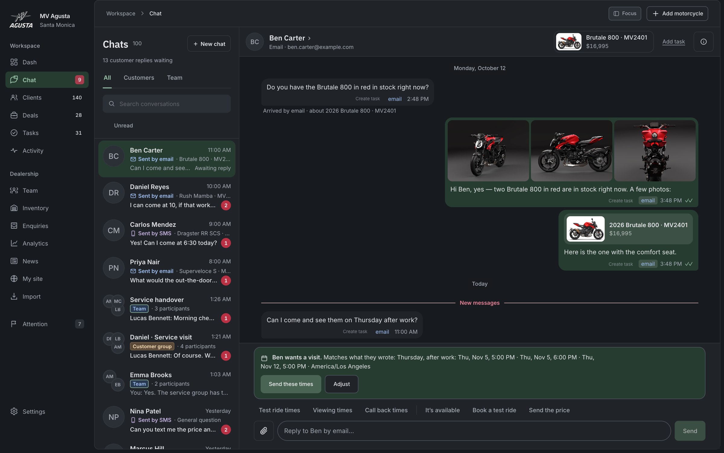
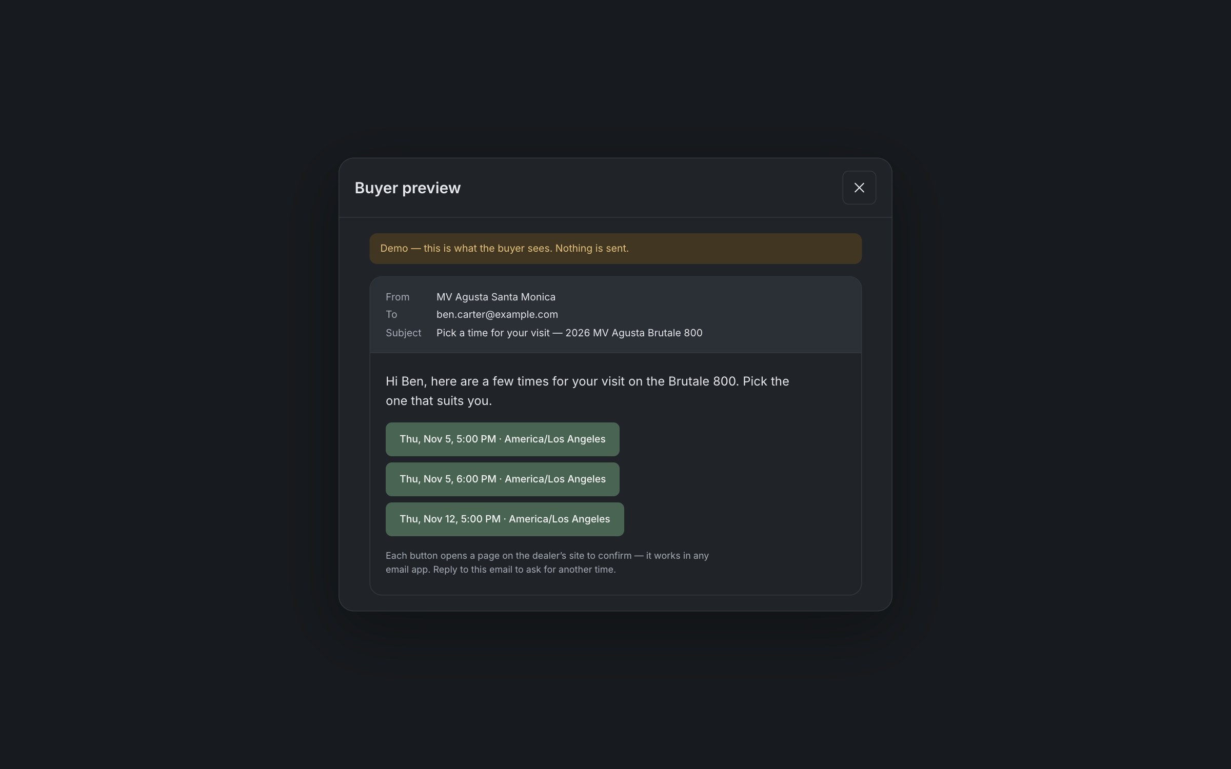
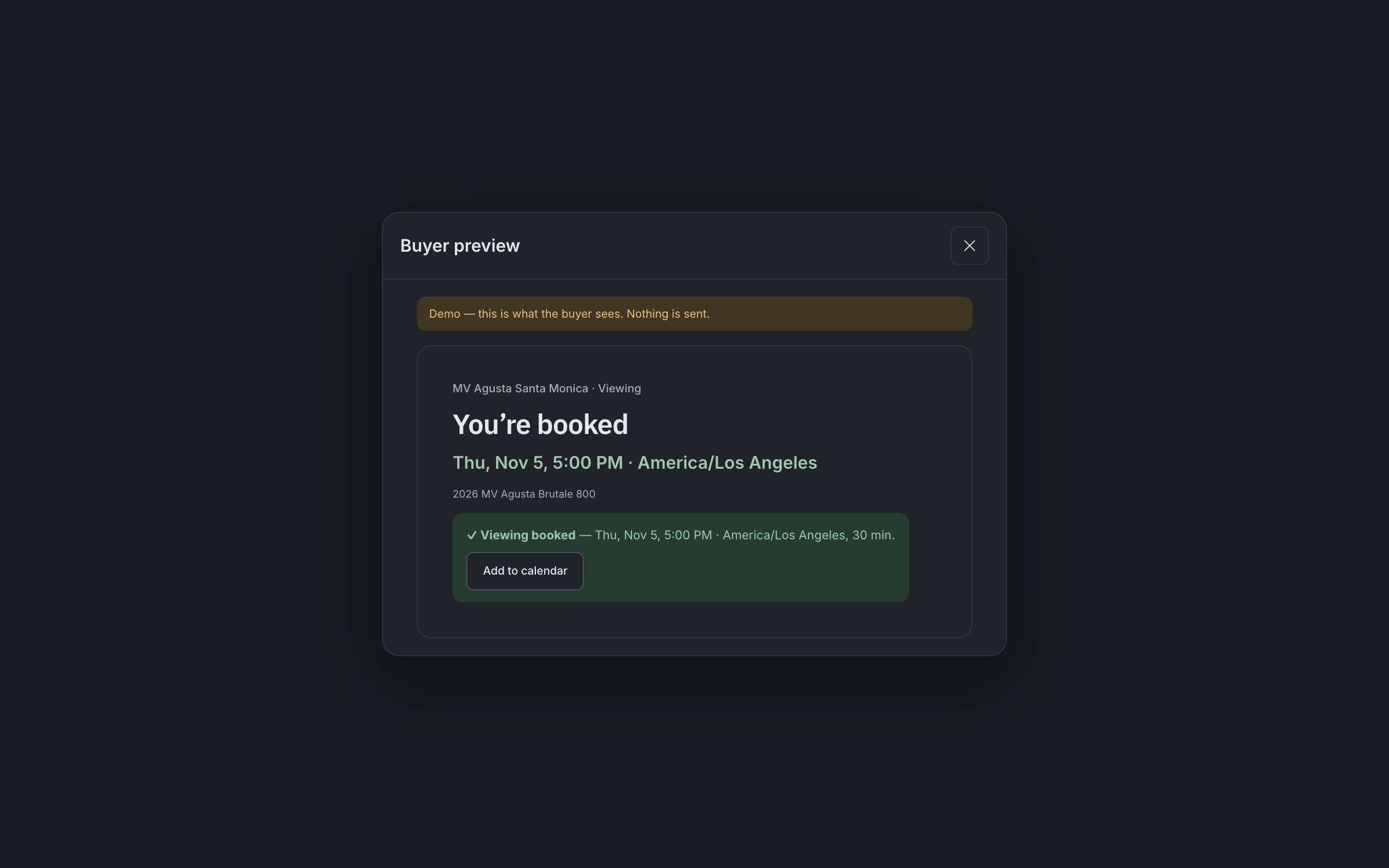
A request such as “Thursday after work” should lead to a visit the buyer can confirm online. We put suggested showroom times inside the conversation, so staff can arrange the visit while the request is in front of them.
The buyer chooses a time, and that choice becomes an appointment linked to the conversation. In this demo, the email preview lets you try the buyer’s part of the flow.
04 / Following through
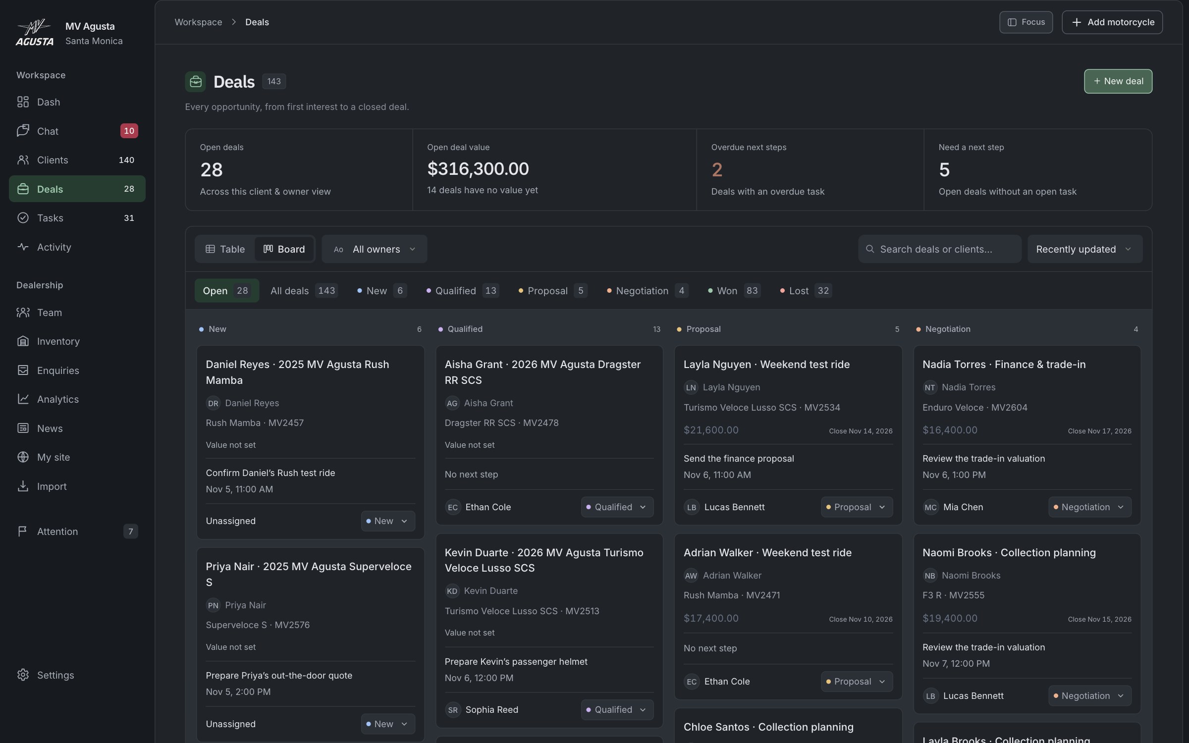
After a reply or a booked visit, the team still needs to know what happens next. Each deal keeps the buyer, the exact motorcycle and the next action together.
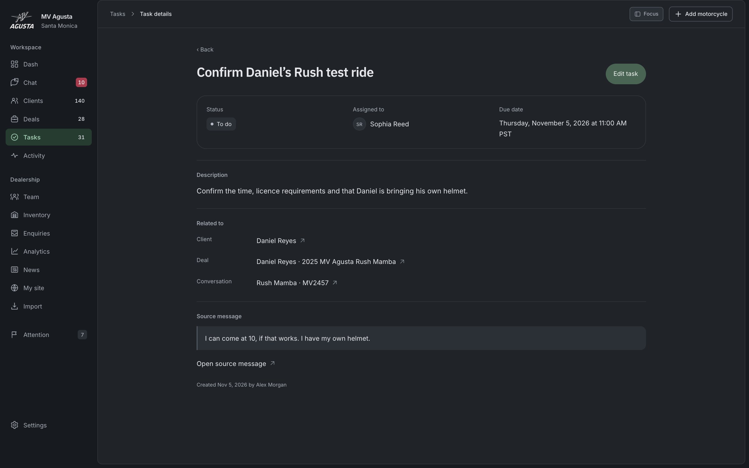
We made the next step a task shared by the deal and the task list, with an owner and a due date. The buyer’s original message can stay attached, so the person following up can see what was agreed. The board highlights overdue steps and deals that still need one.
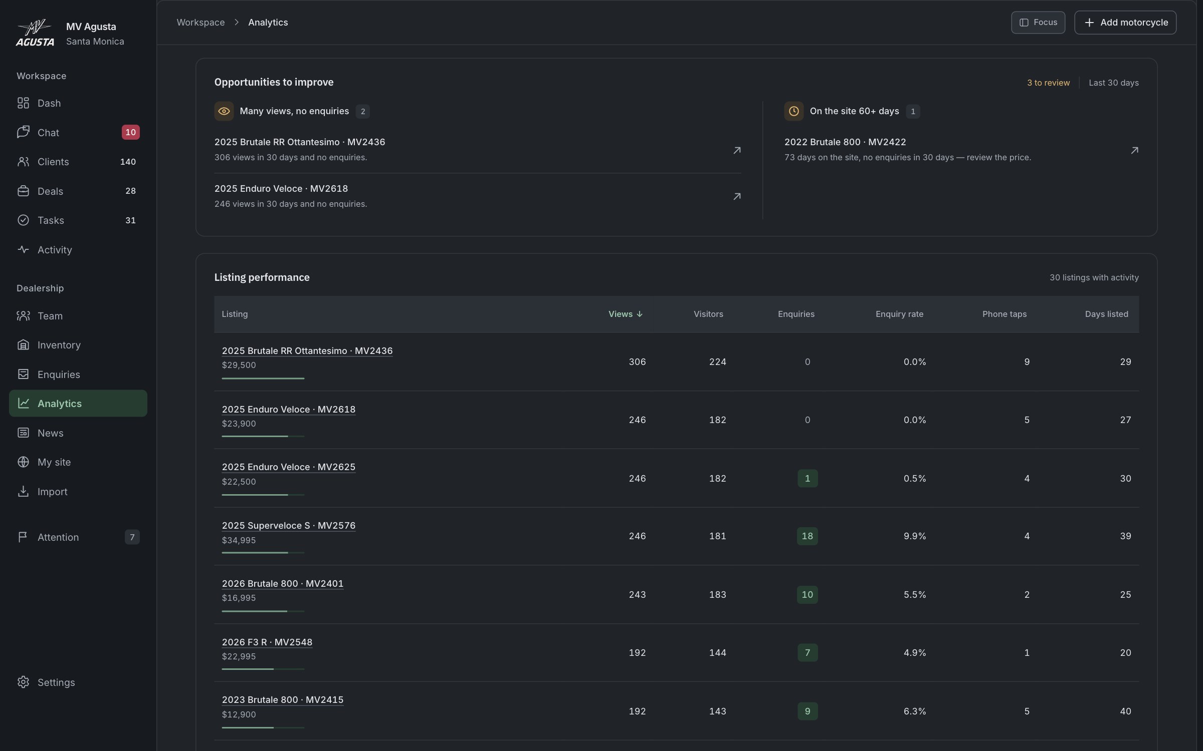
05 / Decisions about stock
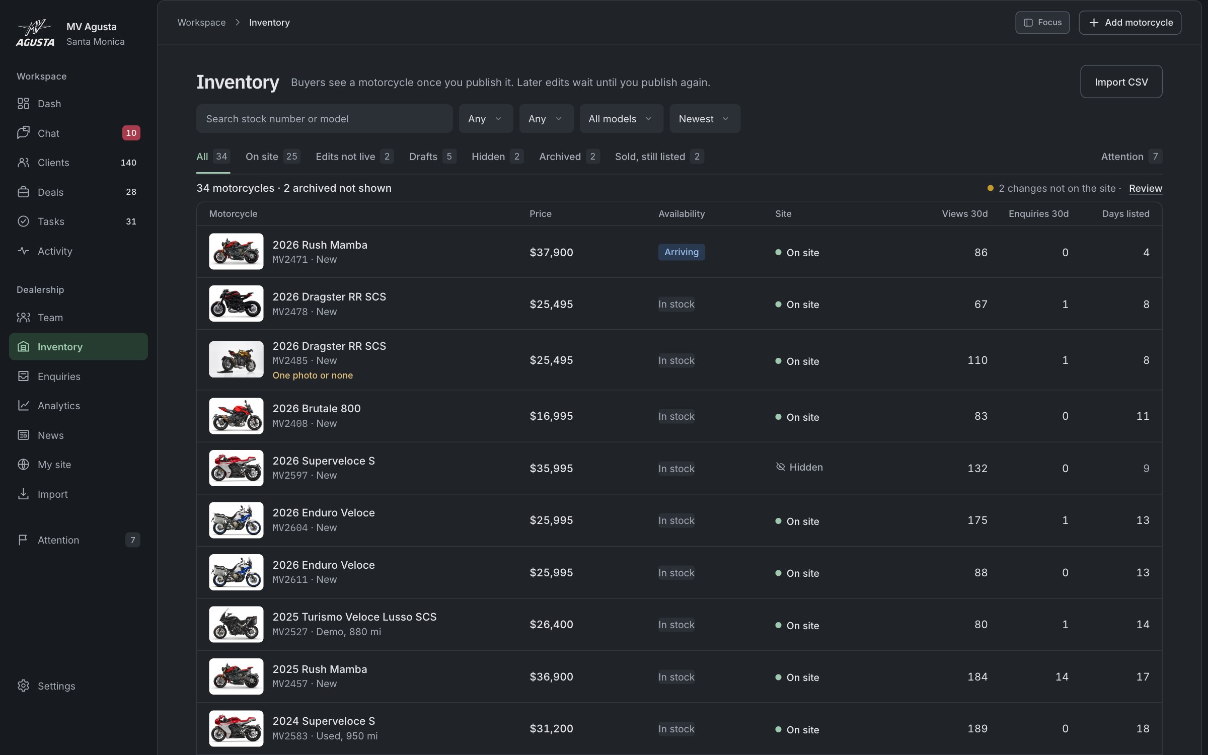
Two motorcycles of the same model can have different prices, availability and time on the site. Combining them would hide the details a dealer needs to make a decision.
We made the individual stock unit the basis of inventory and reporting. Each bike keeps its own views and inquiries. The analytics view brings patterns such as many views with no inquiries to the dealer’s attention, ready for a closer look.
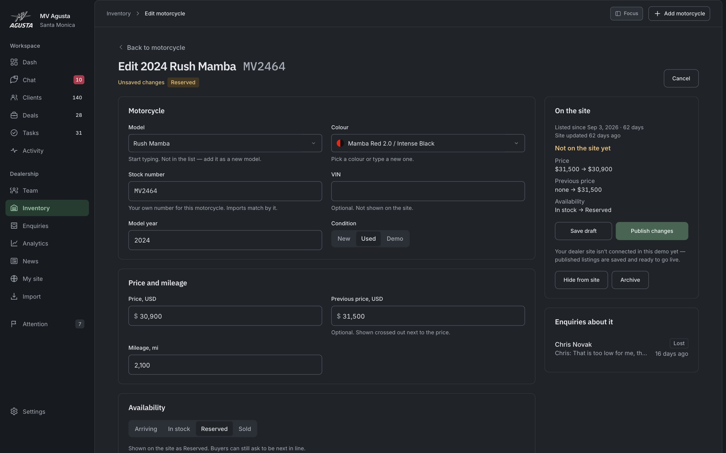
06 / Control over the website
A new price or a Reserved status changes what the dealership is offering. Staff need a chance to check those edits together.
We separated Save draft from Publish changes. Pending changes stay visible field by field, and publication is a deliberate next action. News and CSV imports follow the same rule.
The result
The commissioned design was delivered. We later developed this 28-page showroom in-house, with model pages, stock filters, test rides and service. The version shown uses sample content; its forms validate entries without sending them.
The result
A working app across desktop, tablet and phone, connecting customer conversations, responsibility, visit booking and sales follow-up with inventory and website management. Explore the workflows with sample data; your changes stay in your browser. The demo is not connected to the dealer website, email or SMS services.
© 2026 SKARR.PRO
Categories
Choose your language