
Healthcare App
Product UX


Government services · Digital product
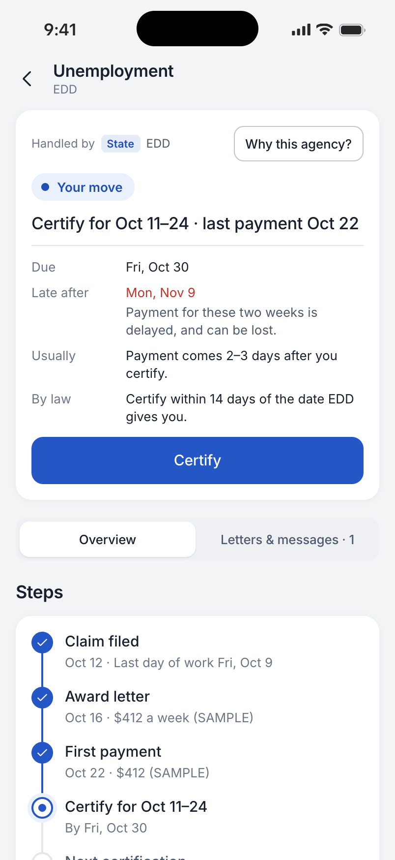
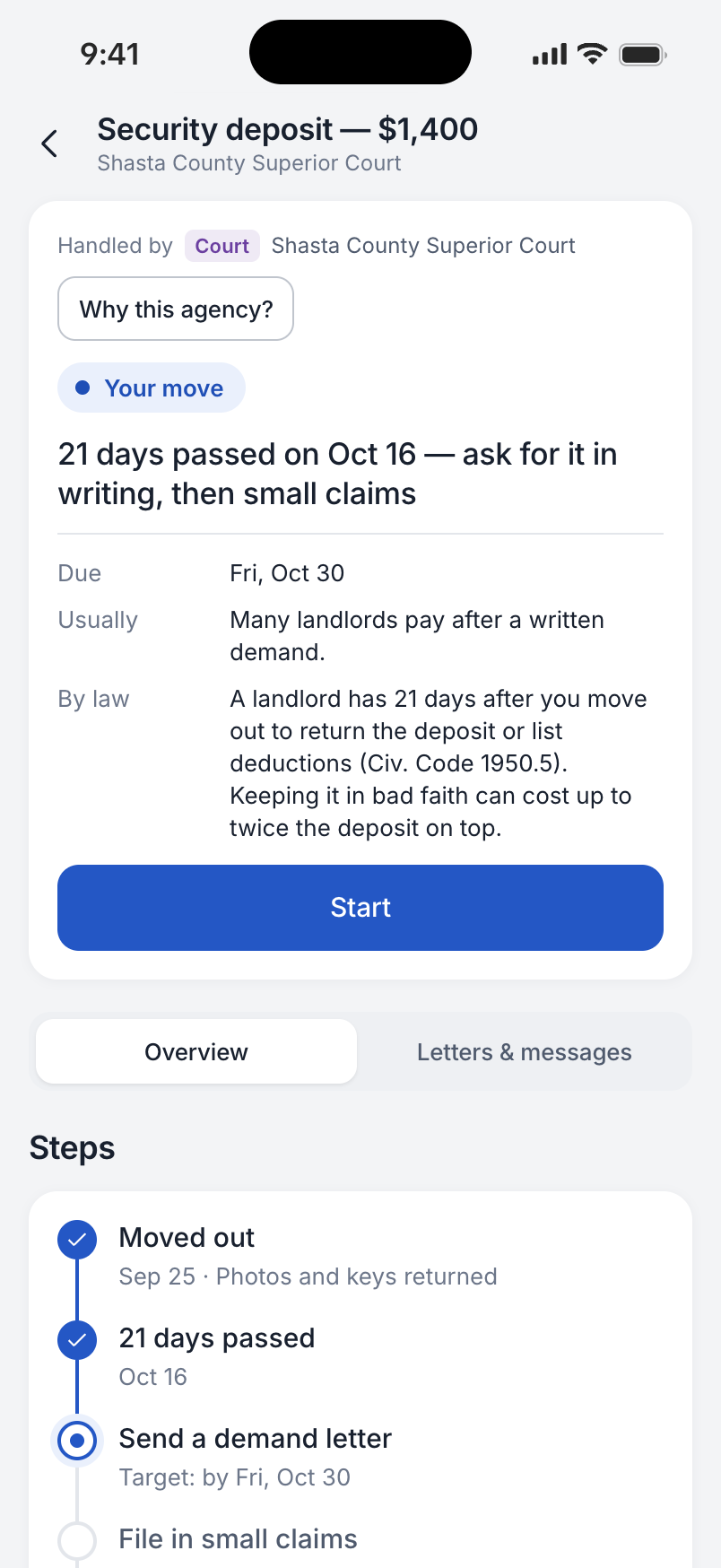
A concept for navigating government services through what is happening in your life. My State helps a person find who handles a request, understand the next step and keep track of the response, using California as the example.
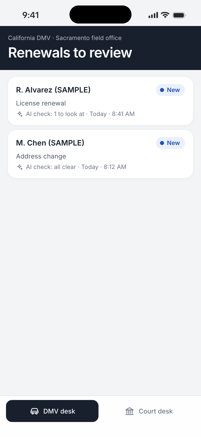
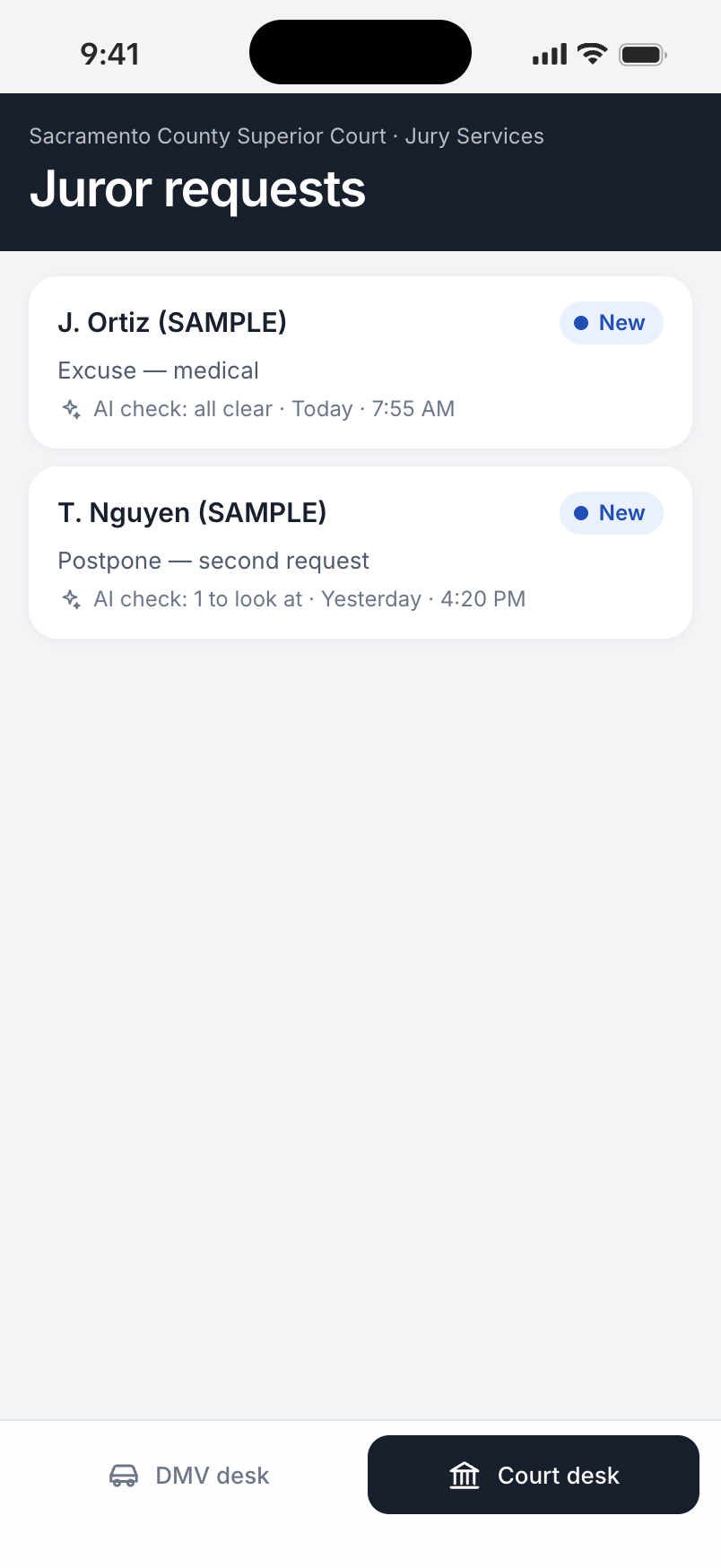
The agency side of the same service concept. A clerk works through requests with the relevant information and a preliminary check beside them, then makes and records a decision.
Losing a job or facing housing trouble can involve several agencies at once. The person must identify the right offices, understand unfamiliar letters and keep separate deadlines in mind. We wanted that work to start from their situation, with a clear path through the agencies involved.
A clearer service also needs a workable way for the agency to respond. Clerks need to see what the person submitted, identify missing information and decide what to do next, without rebuilding the context for every request.
We made the life situation the starting point and used the address to identify the responsible agencies. A plan brings the relevant steps together; each step still names who handles it and explains why.
We kept the ongoing exchange inside the case: status, letters, messages and the next action. We also separated finding an answer from making a consequential decision, with an illustrative benefits comparison showing how a change in pay could affect the household.
We organized the desk around a queue of requests. Each item shows its review state and brings the submitted information and the preliminary check into one view.
We kept the decision with the clerk. A DMV renewal can be approved or sent back for missing information; a court request offers its own relevant decisions. The check points to an issue rather than issuing the decision itself.
We shaped the product around life situations, organized a 546-item service inventory and designed how a person finds the responsible agency, follows a case and responds. We also designed the clerk’s side of the exchange and built both interfaces, using California scenarios to make the broader concept concrete.
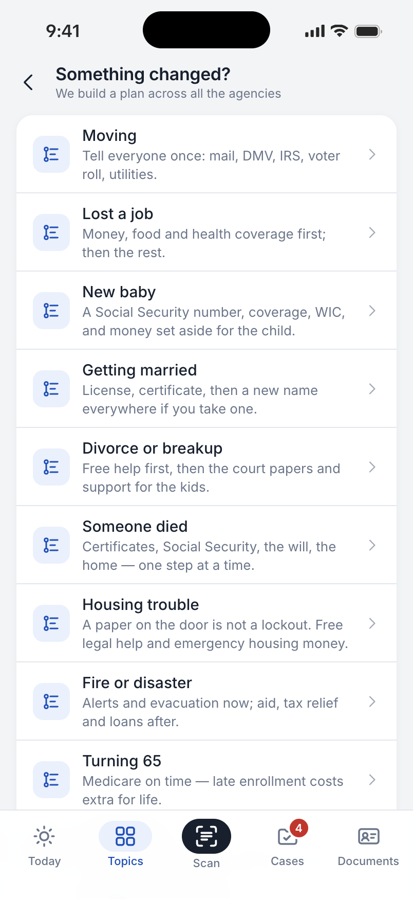
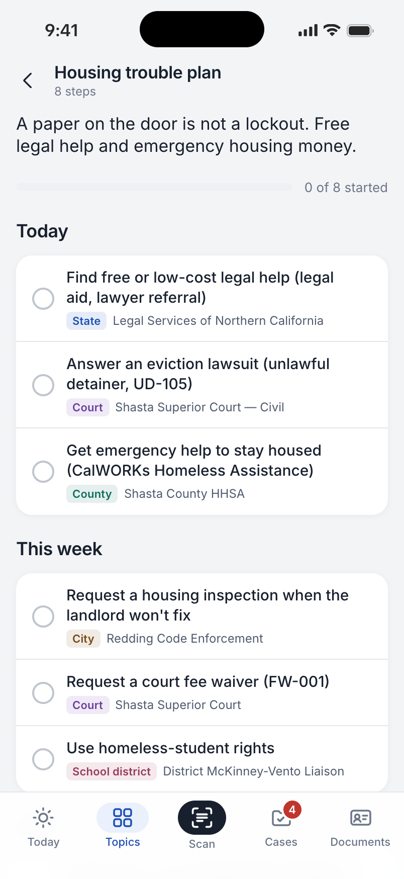
01 / Start with the situation
Housing trouble, a lost job or a move are understandable starting points. We used those situations to gather the relevant services into a plan, ordered as today, this week and later.
The housing example brings state, court, county, city and school responsibilities into one sequence. Each step names its owner, so the person can see how the parts relate without having to learn the structure of government first.
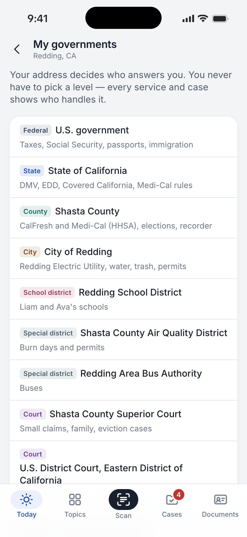
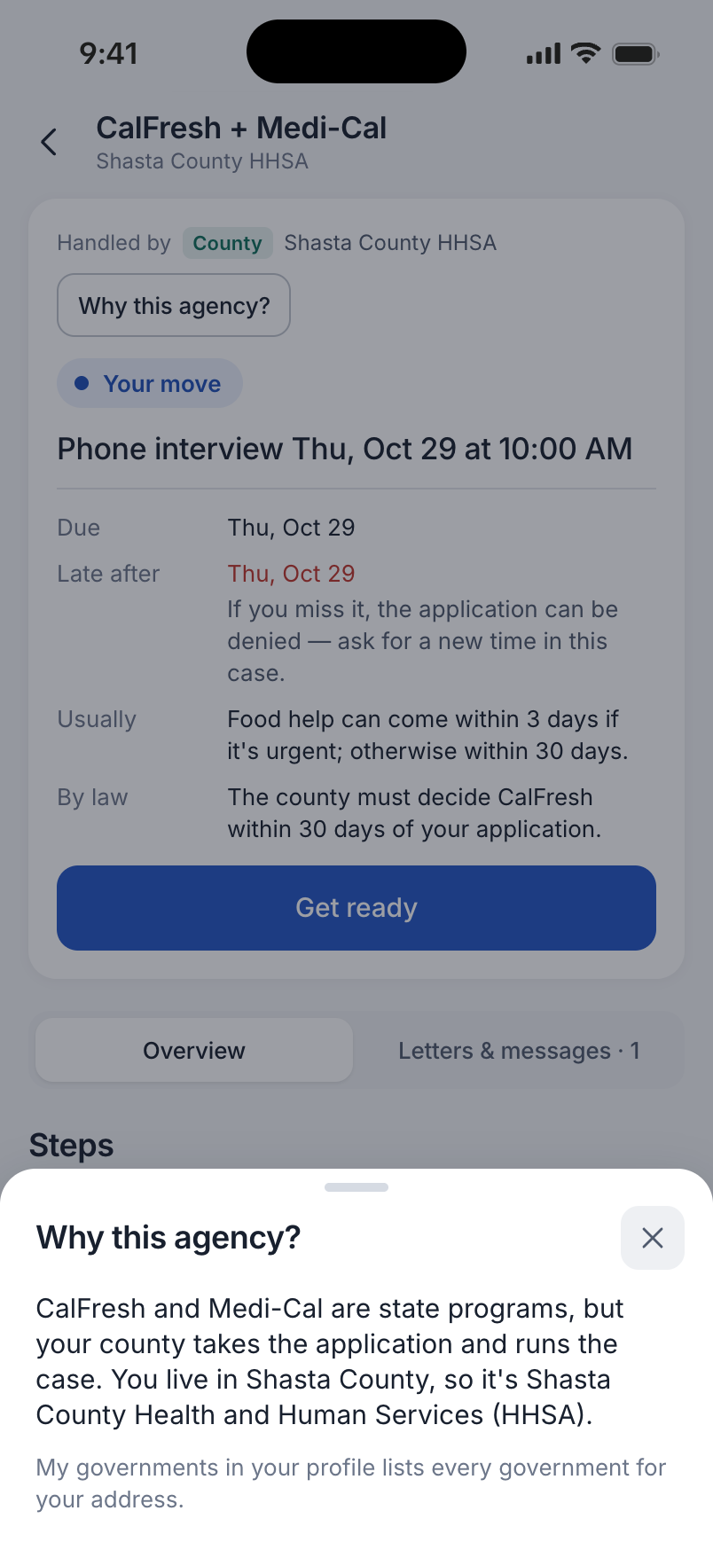
02 / Find the right office
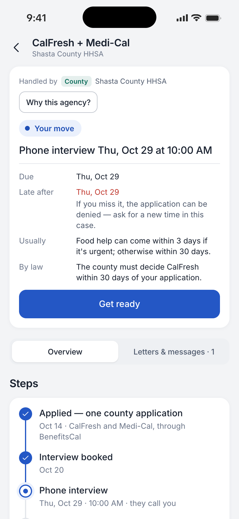
The same need can lead to a different office at a different address. My governments shows the jurisdictions attached to the sample address, and each case carries the agency responsible for that request.
Why this agency? makes that choice explainable. The implemented examples cover Shasta and Sacramento counties; they demonstrate the address-based approach rather than a nationwide routing service.
03 / Keep the exchange together
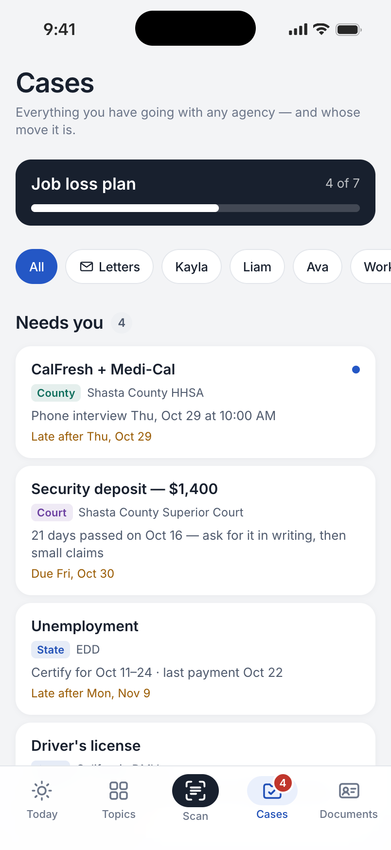
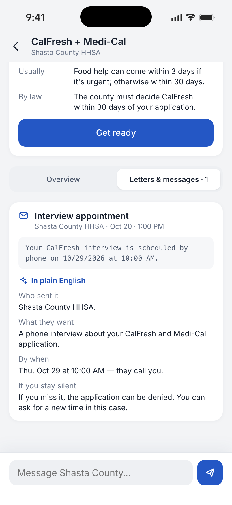
A case holds the request, the responsible agency and the next action together. The list makes pending work visible; opening a case brings the relevant letter and response field into the same place.
We designed the exchange for an answer that can arrive later, without requiring the person to stay on a call. The sample replies show how this could work; no messages are sent to an agency.
04 / Understand the letter
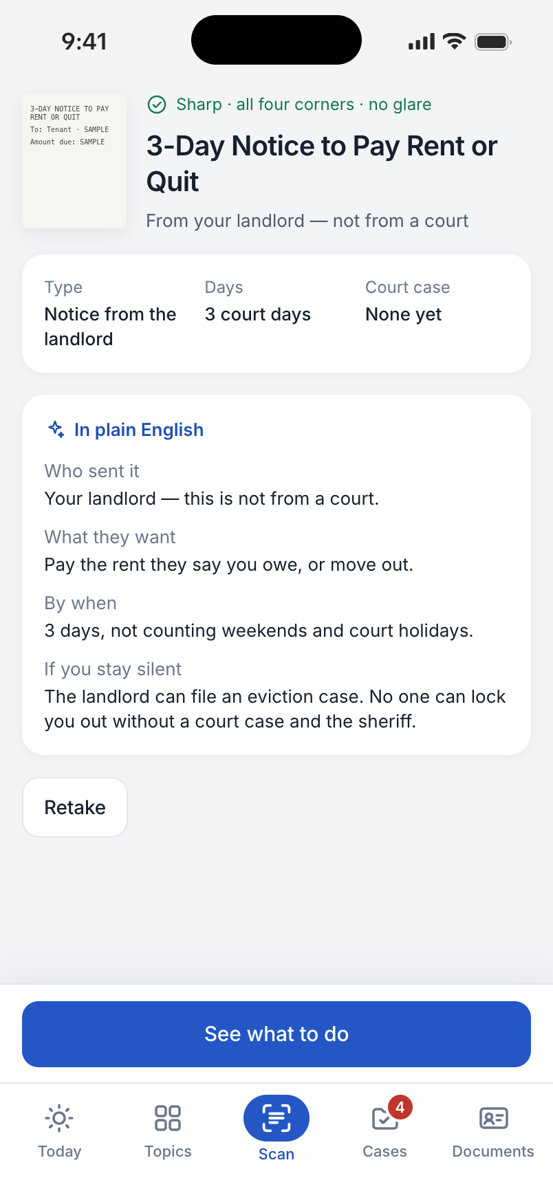
An official-looking letter can leave a person unsure who sent it or what it requires. The letter view separates the sender, the requested action and the stated deadline, then places the paper in the context of the case.
The notice shown here is a prepared example, and the camera is simulated. It demonstrates the explanation format, without claiming that the app can interpret any legal document.
05 / Examine a change
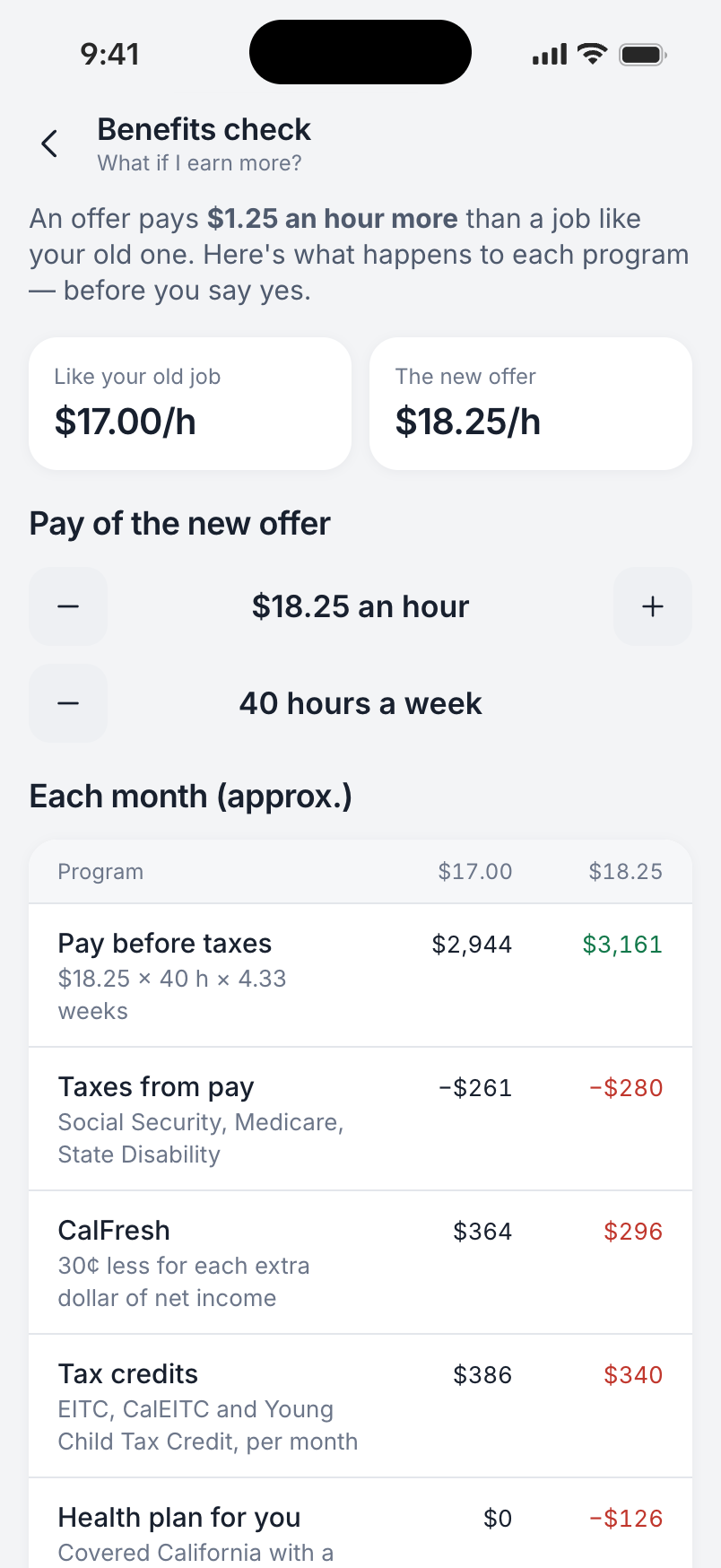
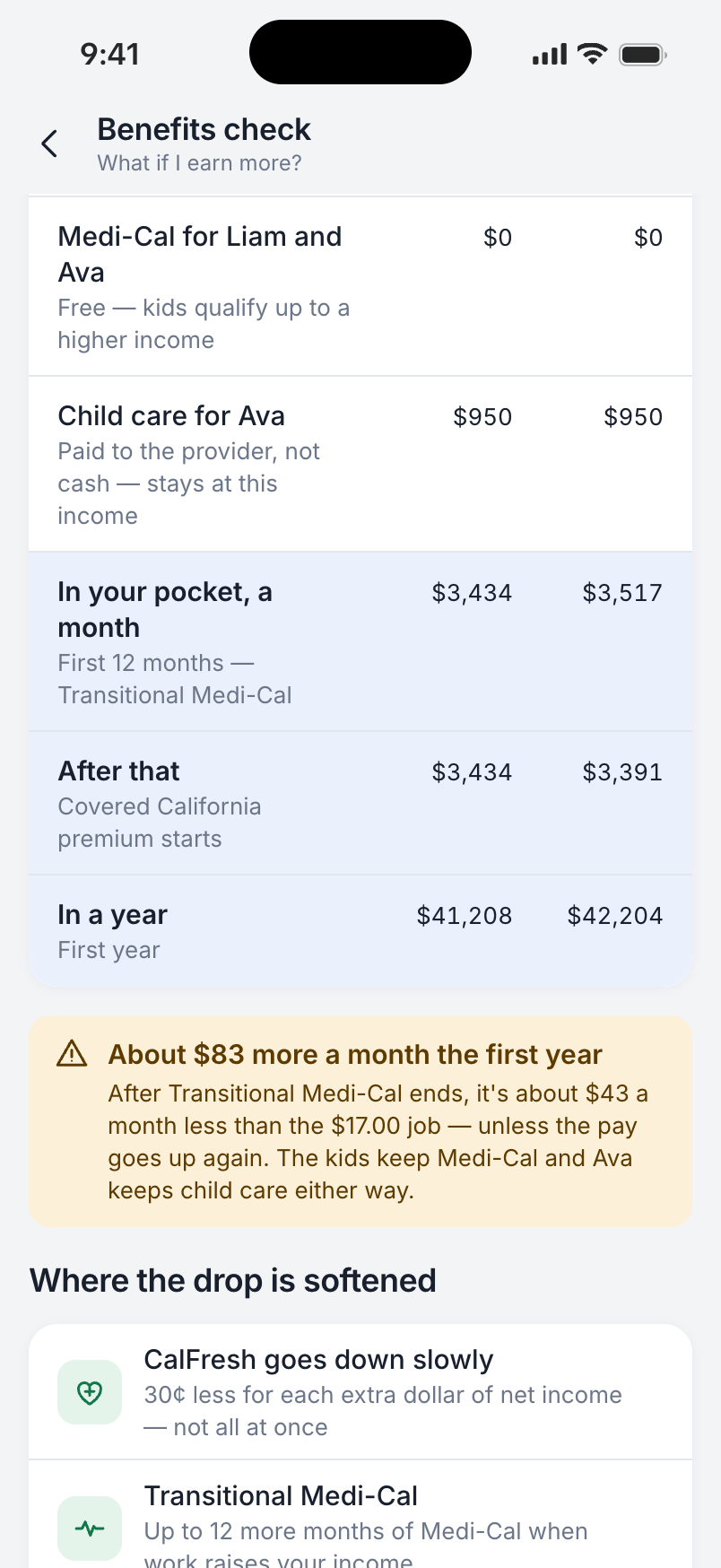
A pay increase can also change household support. We gave that trade-off its own comparison: income and programs at the current pay beside the proposed pay, followed by the estimated amount left.
The example distinguishes the first year from later years so a temporary benefit does not look permanent. It uses approximate sample amounts based on 2025 rules; it is an illustration of the decision, not an eligibility determination.
01 / Review and respond
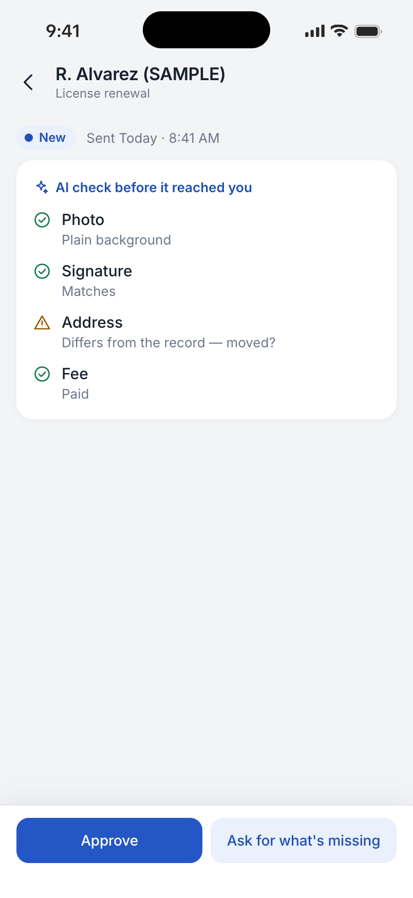
In the DMV example, the review separates the checks that passed from an address that differs from the record. The clerk can see the issue and choose whether to approve or ask for more information.
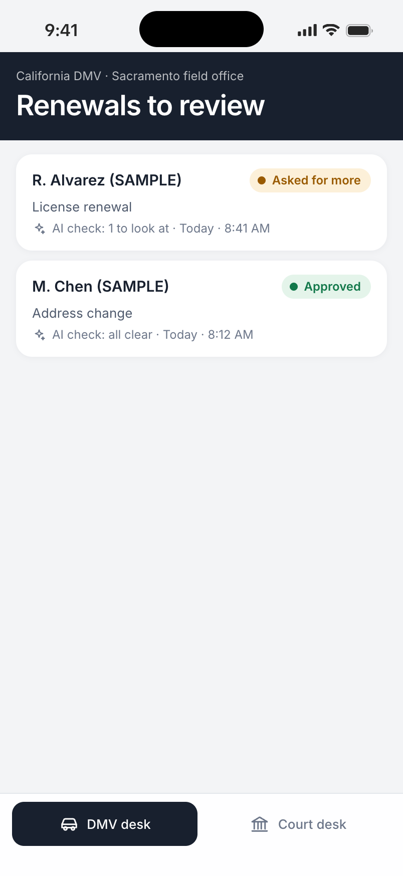
The queue then records the decisions: one request approved, another awaiting more information. These checks are prepared examples, and the shown decisions update the sample queue. They demonstrate the clerk’s workflow without implying a live agency exchange.
The result
The result demonstrates how a person could move from a life situation to the right agency, follow a request and understand the next step, with a corresponding workflow for the clerk. Explore the resident experience with sample data. My State is an independent concept; agency connections, checks, identity features and replies are simulated.
© 2026 SKARR.PRO
Categories
Choose your language