
Healthcare App
Product UX
Flower brand · Concept website
A self-initiated website concept for Traditional, a Los Angeles cannabis brand. We translated the character of its packaging into expressive strain pages, supported by a clear catalog, product formats and store finder.
Traditional’s packaging gives each strain its own colours and artwork. We set out to preserve that individuality in a website that also makes a varied assortment understandable: what the strain is, which formats it comes in and where to find the brand.
We developed the website concept, information architecture, visual design and frontend. The brand’s existing packaging and imagery became the starting material for our own page compositions, typography, colour system and interactions.
We gave the site two complementary modes: expressive pages for exploring a strain and a quieter catalog for comparing the assortment. A shared page structure lets each strain keep its identity while remaining part of one website.
Each strain combines its package image, palette and content with a reusable page structure. Collections, formats and store information connect that visual story to a practical route through the assortment.
01 / Visual direction
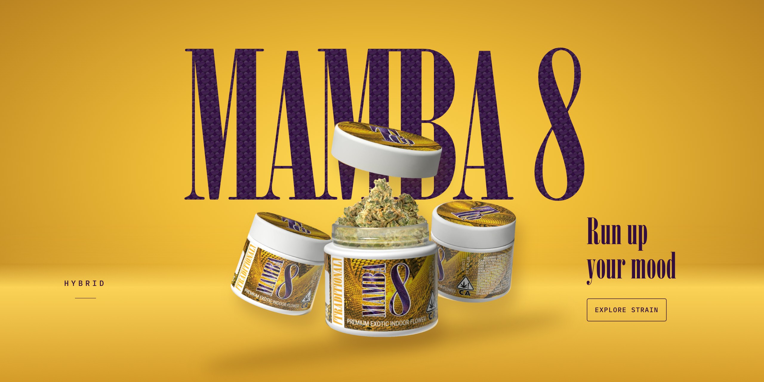
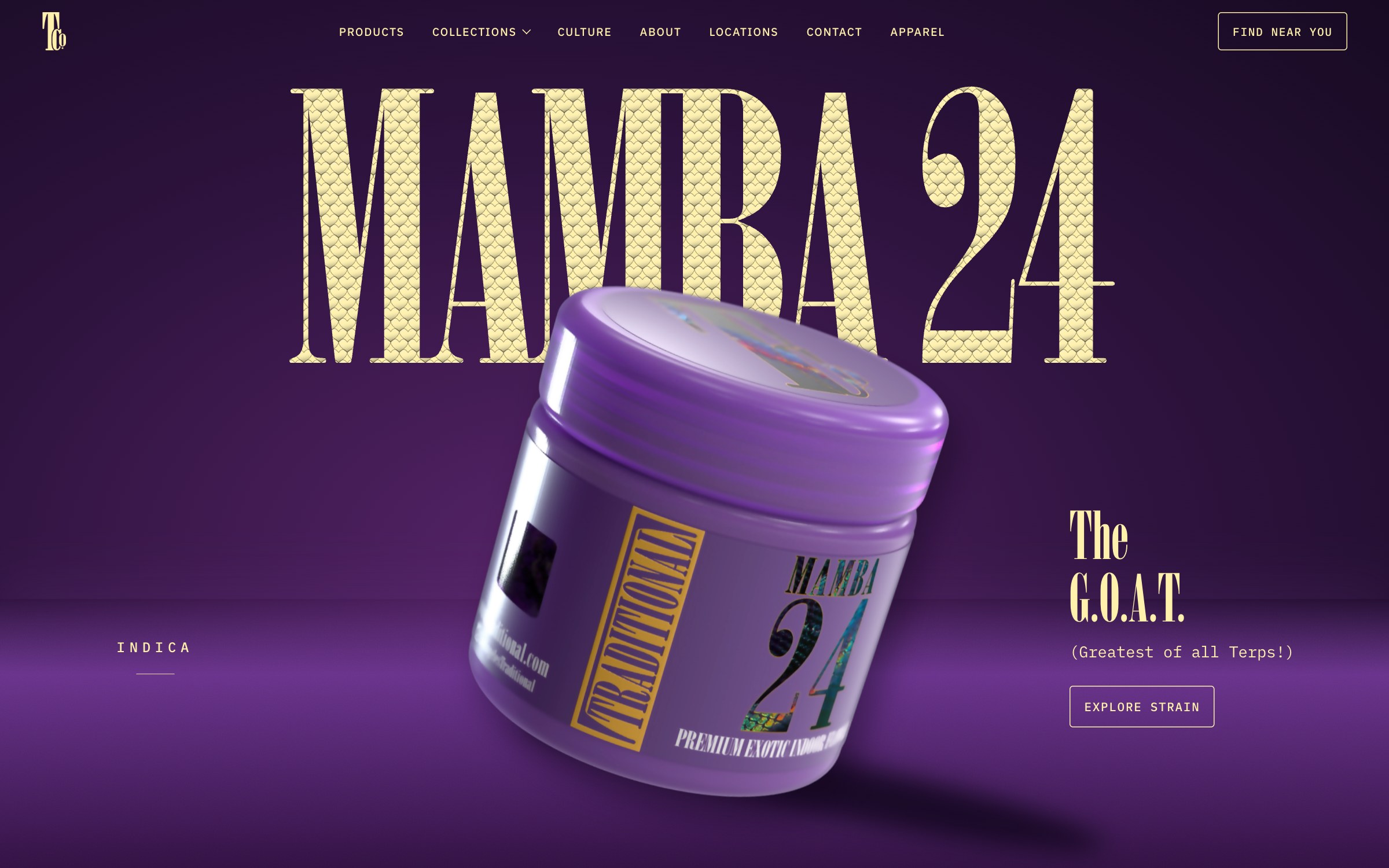
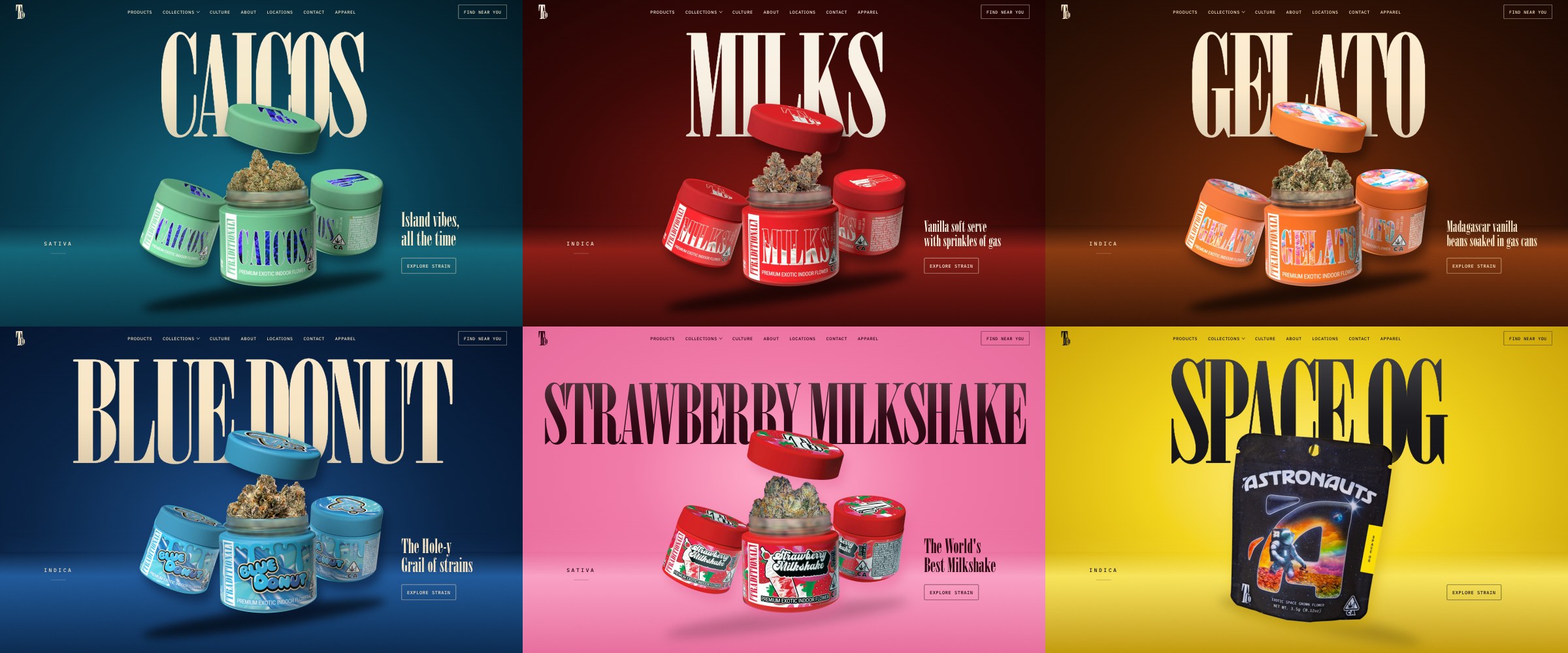
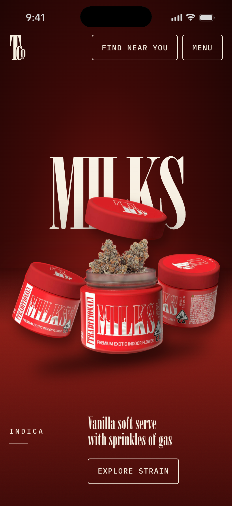
We treated the opening of each strain page as a poster. The package overlaps the oversized name, while its colours and graphic details extend into the background and typography.
Mamba 24 pairs a purple field with textured gold lettering. Other strains use the same composition with their own palettes and package images. We built the variation into the page system, so adding a strain does not require designing another layout.
02 / Comparing the assortment
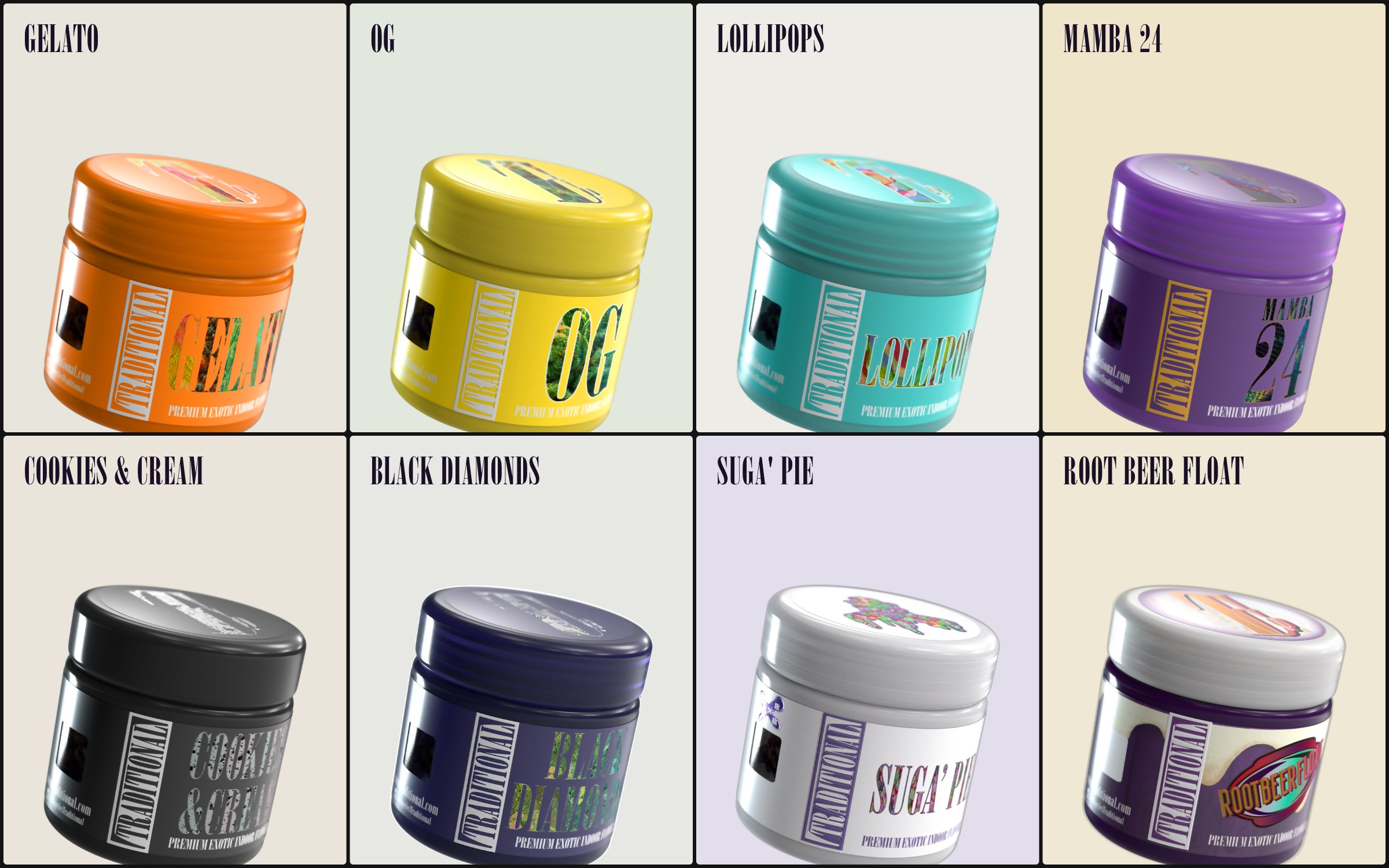
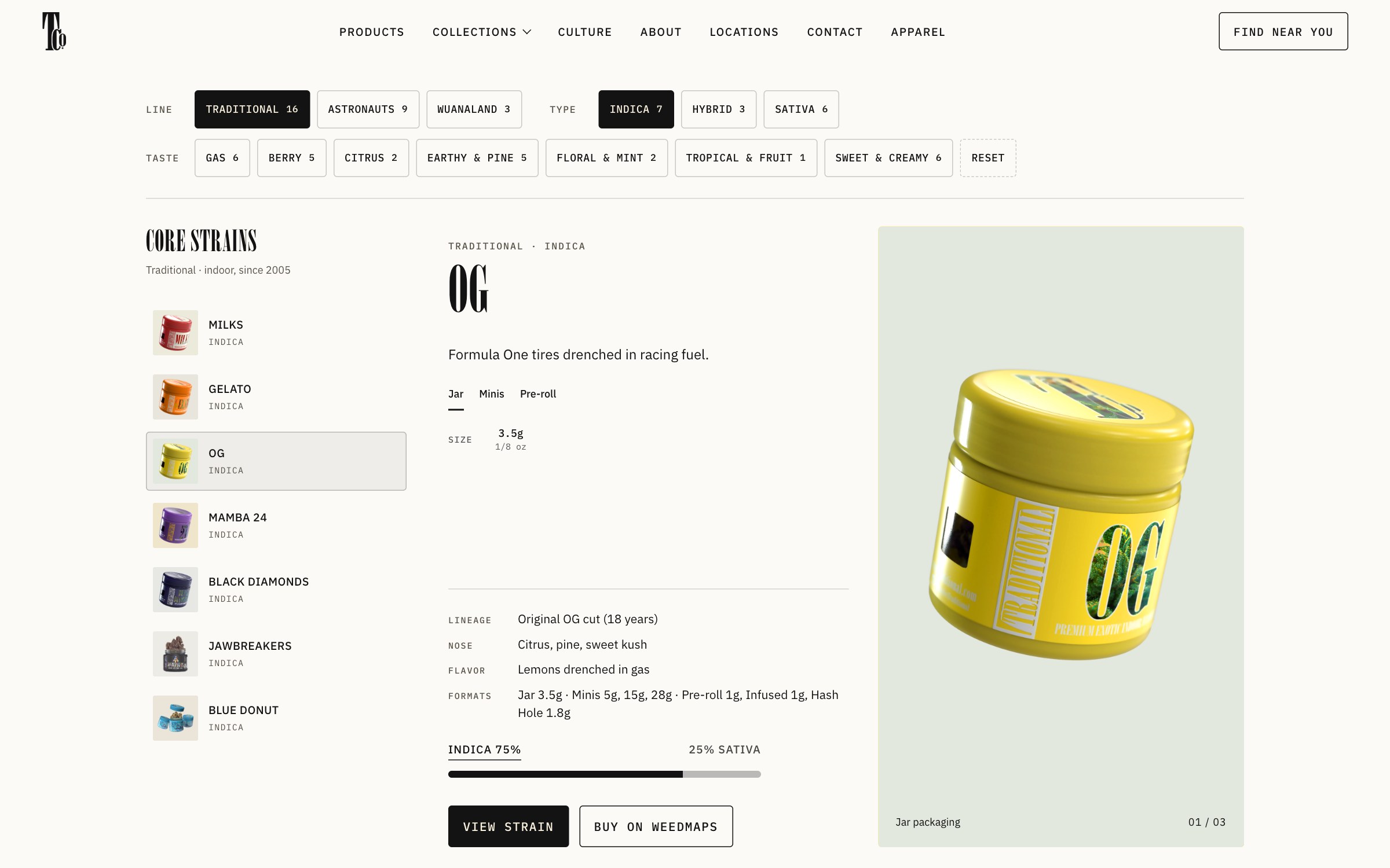
A visitor comparing several strains needs stable information and clear controls. We placed the catalog on a neutral field, with filters by line, type and taste and the selected strain’s details beside the list.
Filter counts show the available choices. On desktop, the panel keeps its height as the selection changes, and the filter state stays in the URL so a particular view can be shared.
03 / Product structure
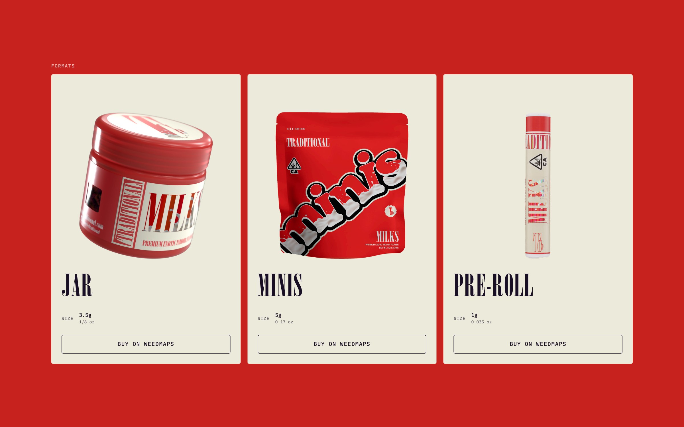
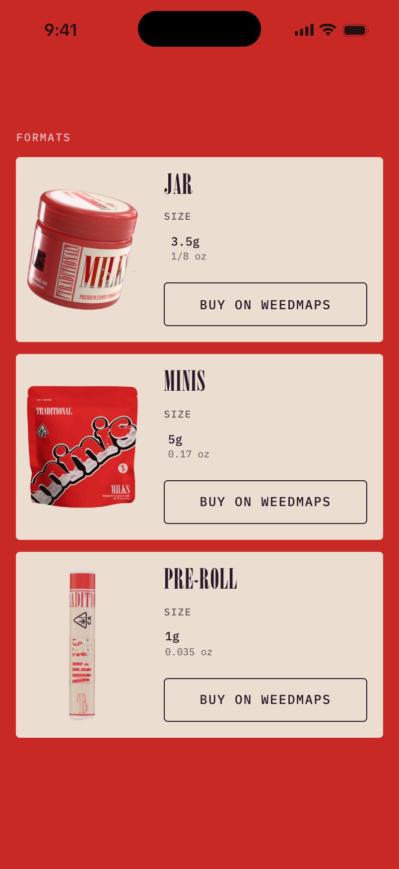
The same strain can come in a jar, Minis or a pre-roll. We kept those options within the strain page and gave each format its own package image and sizes.
This makes the relationship clear before the visitor follows an external store link. The strain’s identity carries through; the format changes.

04 / Mobile composition
We adapted the poster as a full-height mobile composition, keeping the strain name, package and colour together. The Milks poster leads into the formats for the same strain.
Further down, format cards stack in a single column, with sizes and the next action within each card. The mobile layout preserves the expressive opening and the practical sequence that follows it.
05 / Finding a store
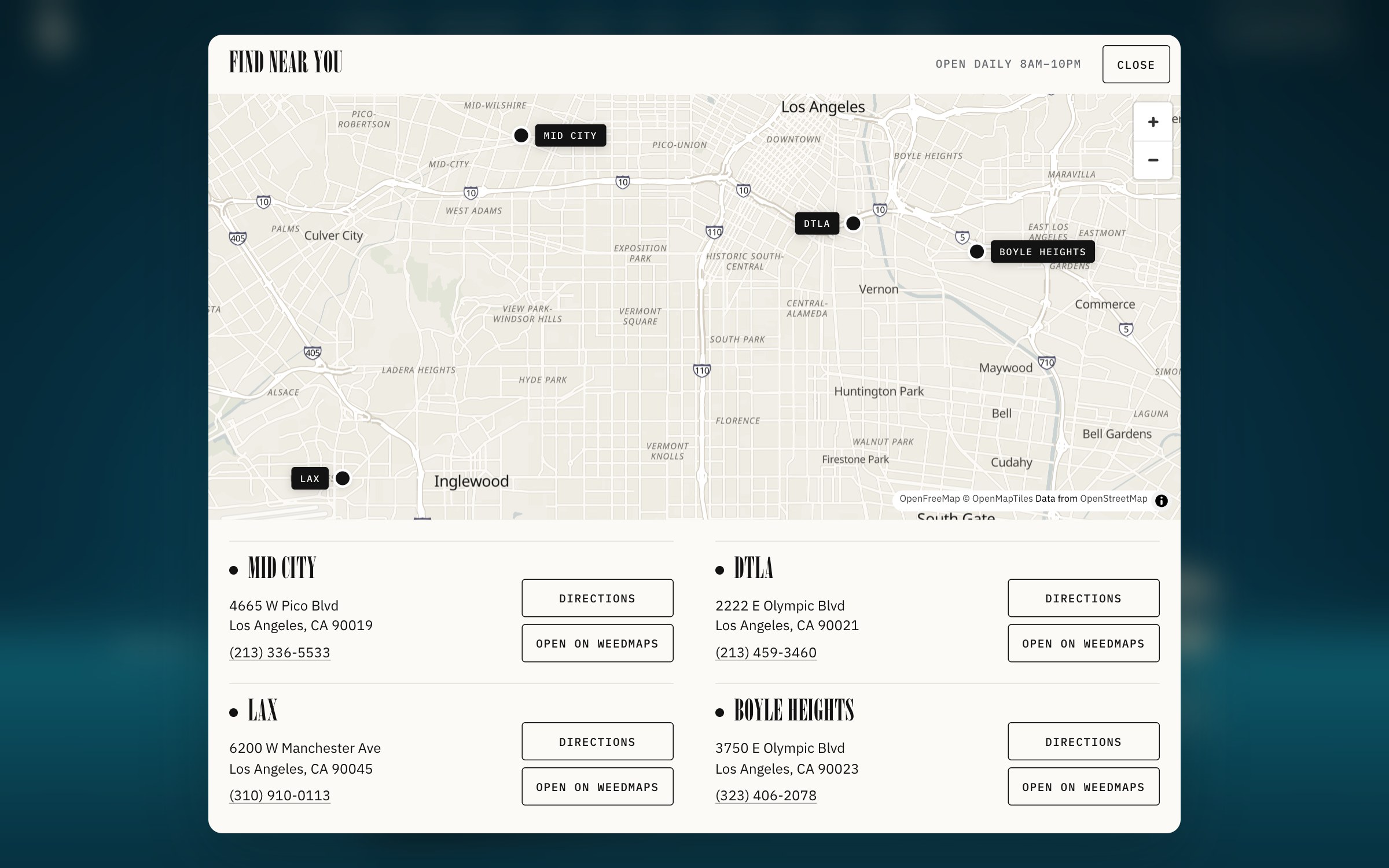
The store finder is available from the header on every page. We brought four Los Angeles locations into one map, with addresses, directions and links to their Weedmaps pages.
The concept’s role is to introduce the assortment and help people find a store. Product and location actions lead to Weedmaps; the website itself has no checkout.
The result
The working concept connects individual strain stories, a filterable catalog, format choices and store locations within one visual system, adapted for desktop and phone.
© 2026 SKARR.PRO
Categories
Choose your language