
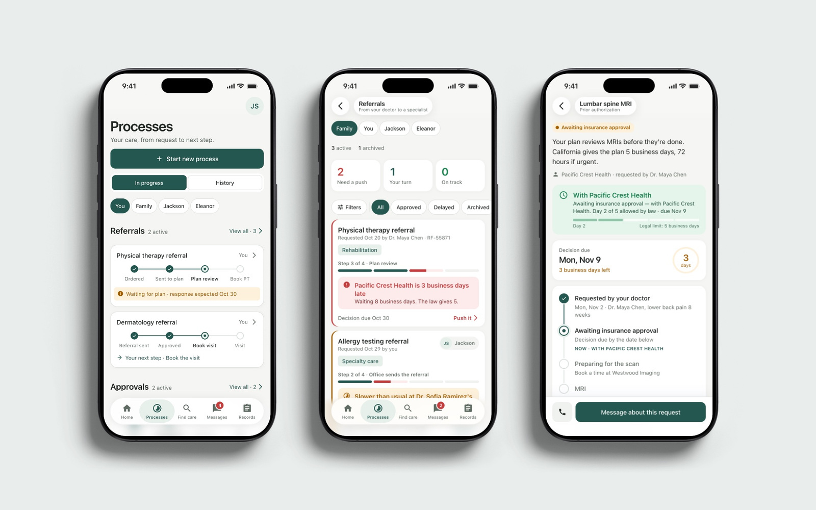
Healthcare App
Product UX


Banking · Digital product
A banking app concept that helps people understand what their money is doing and decide what to do next. Its assistant, Oracul, brings unusual spending, repeat charges and upcoming commitments to the surface, with an explanation and an action.
A balance tells you what is left, but it does not explain what changed or which decision needs your attention. We set out to make everyday money management less dependent on reading reports, remembering renewal dates and calculating the consequences yourself.
We made noticing, explaining and acting one sequence. Oracul names the pattern, shows the amounts behind it and opens the relevant next step. The person can inspect the evidence, act or leave it for later.
We separated decisions that need attention now from planning ahead. Renewals and duplicate charges have deadlines; budgets compare intention with actual spending; What if shows how a proposed change affects the current plan before any money moves.
We defined the product logic, designed the mobile interface and built the frontend. Alongside the original concept, we reviewed 4,000 App Store reviews across eight US banking and payment apps and compared twelve money products. That work helped connect everyday frustrations to concrete interface decisions, from understanding recurring costs to copying card details.
01 / Notice
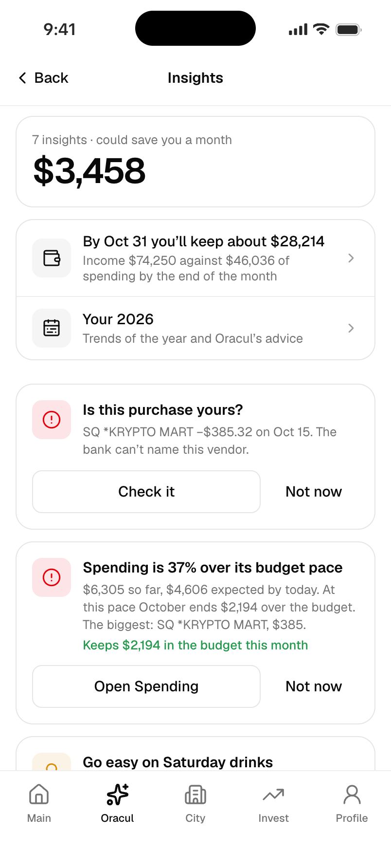
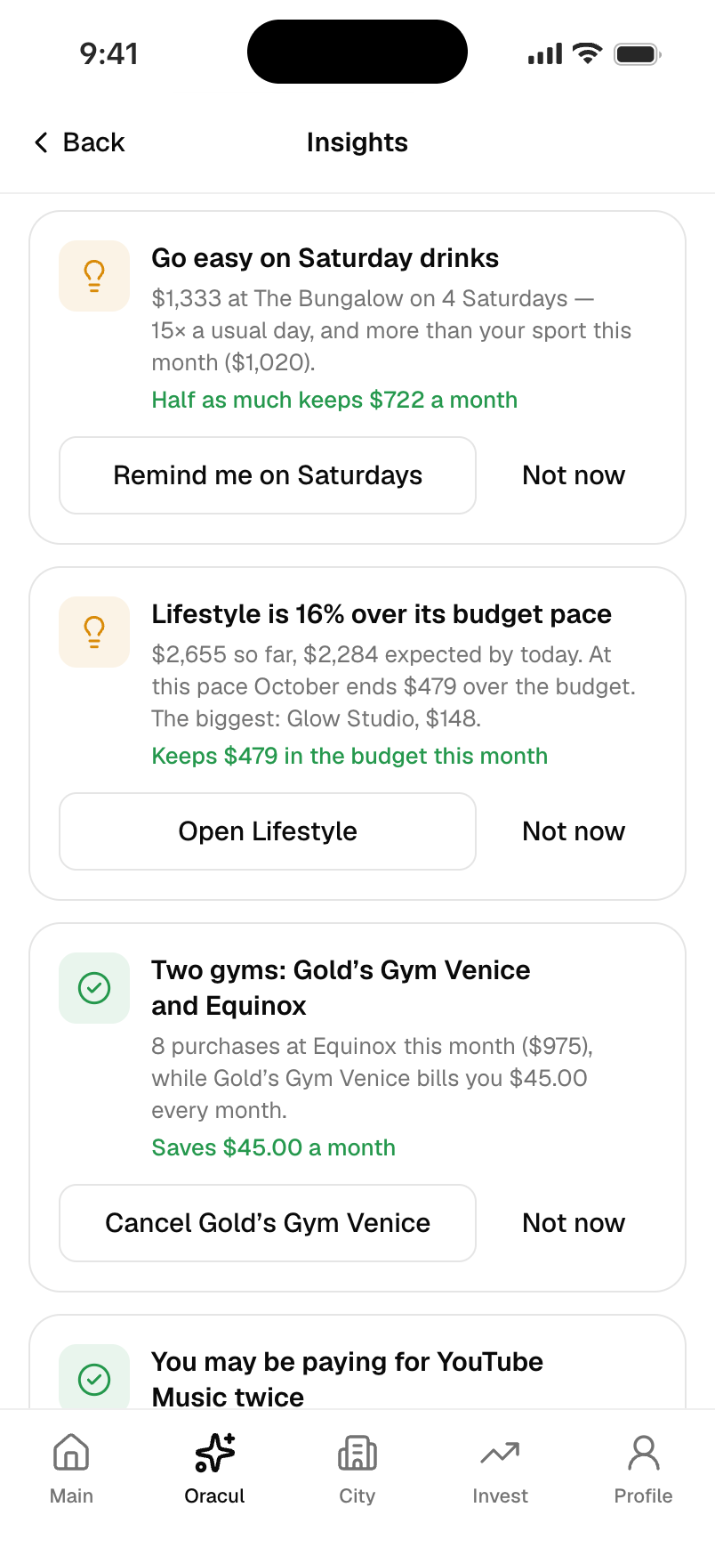
A category total leaves the interpretation to the person. Oracul instead points to a specific pattern: four Saturdays at one bar, its cost and what spending less could leave for other priorities. The numbers sit beside the suggestion so the person can judge it.
The screenshot uses sample transactions: $1,333 over four Saturdays. The $722 monthly estimate takes half the average Saturday spend and projects it across an average month. Showing the source transactions keeps that estimate open to review.
02 / Act
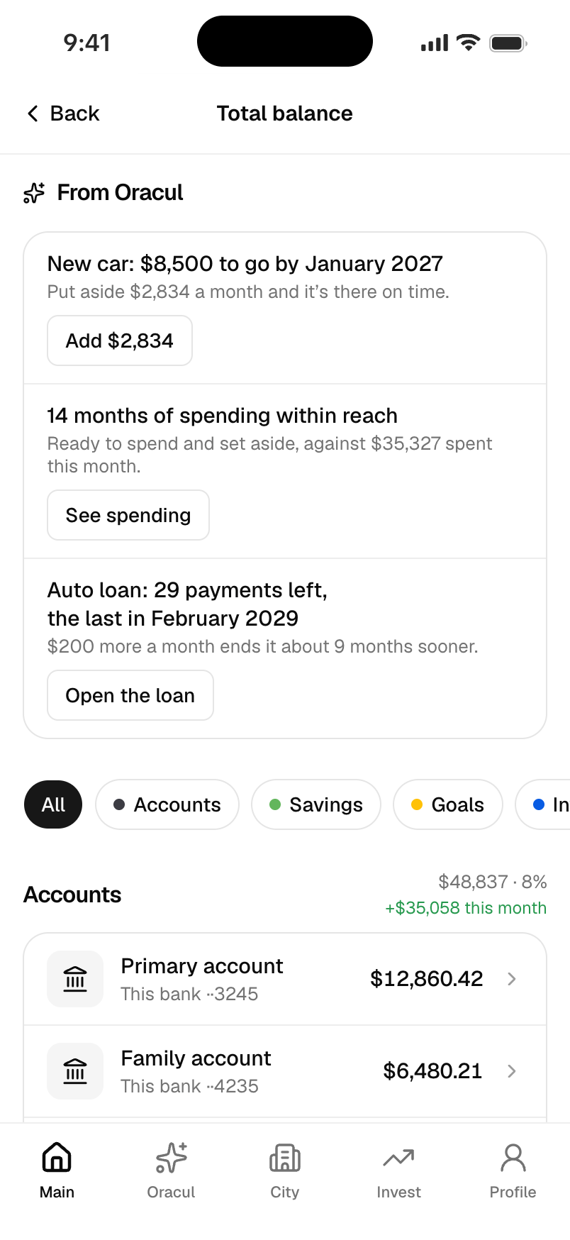
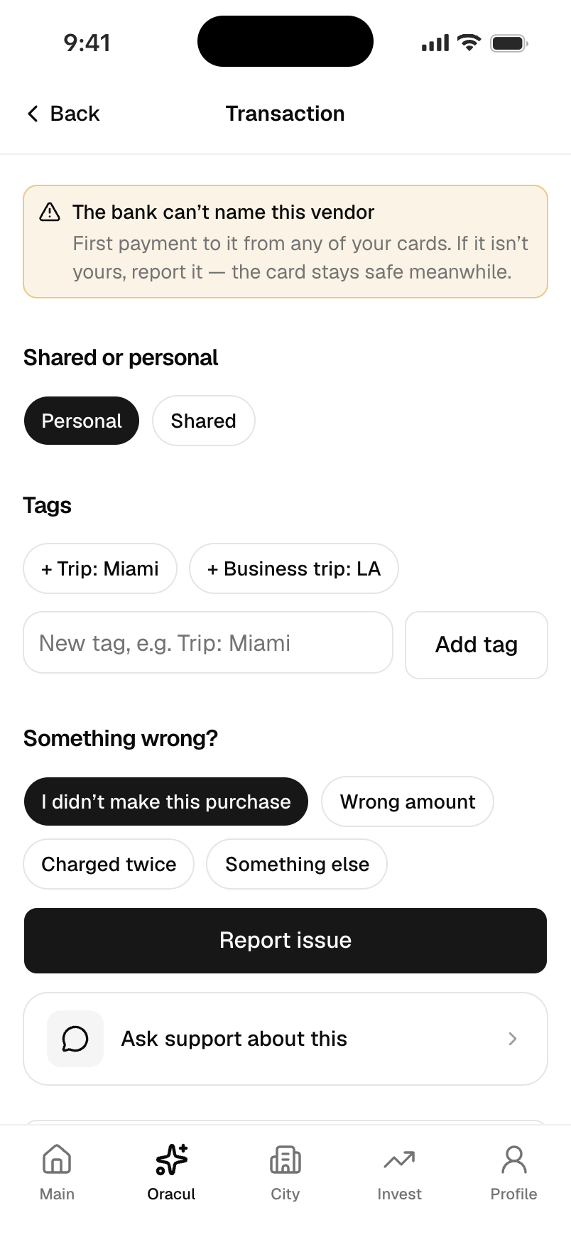
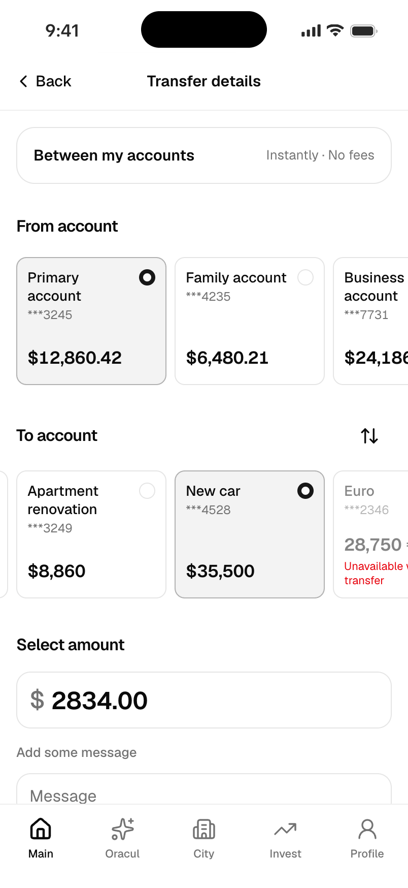
An explanation is more useful when it leads somewhere specific. Checking an unfamiliar purchase opens that transaction and its reporting options. A suggestion to save for a car opens a transfer with the destination and amount already filled in.
We kept the decision with the person: review the details and confirm the action. The app carries the context forward instead of making them remember a sum and find the right screen again.
03 / Recurring costs
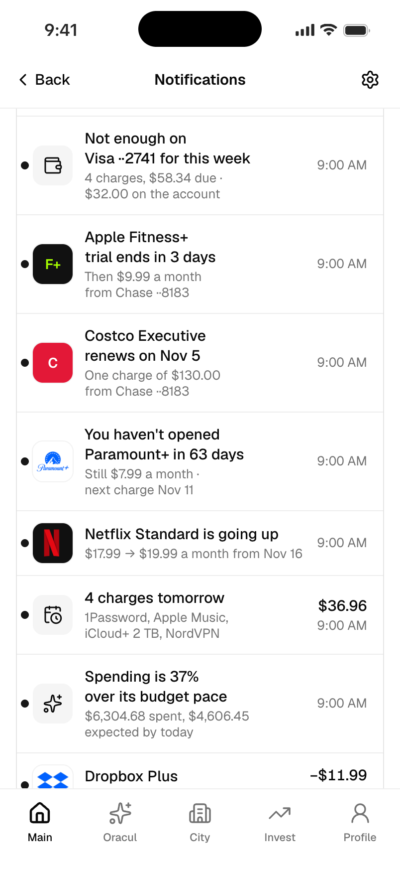
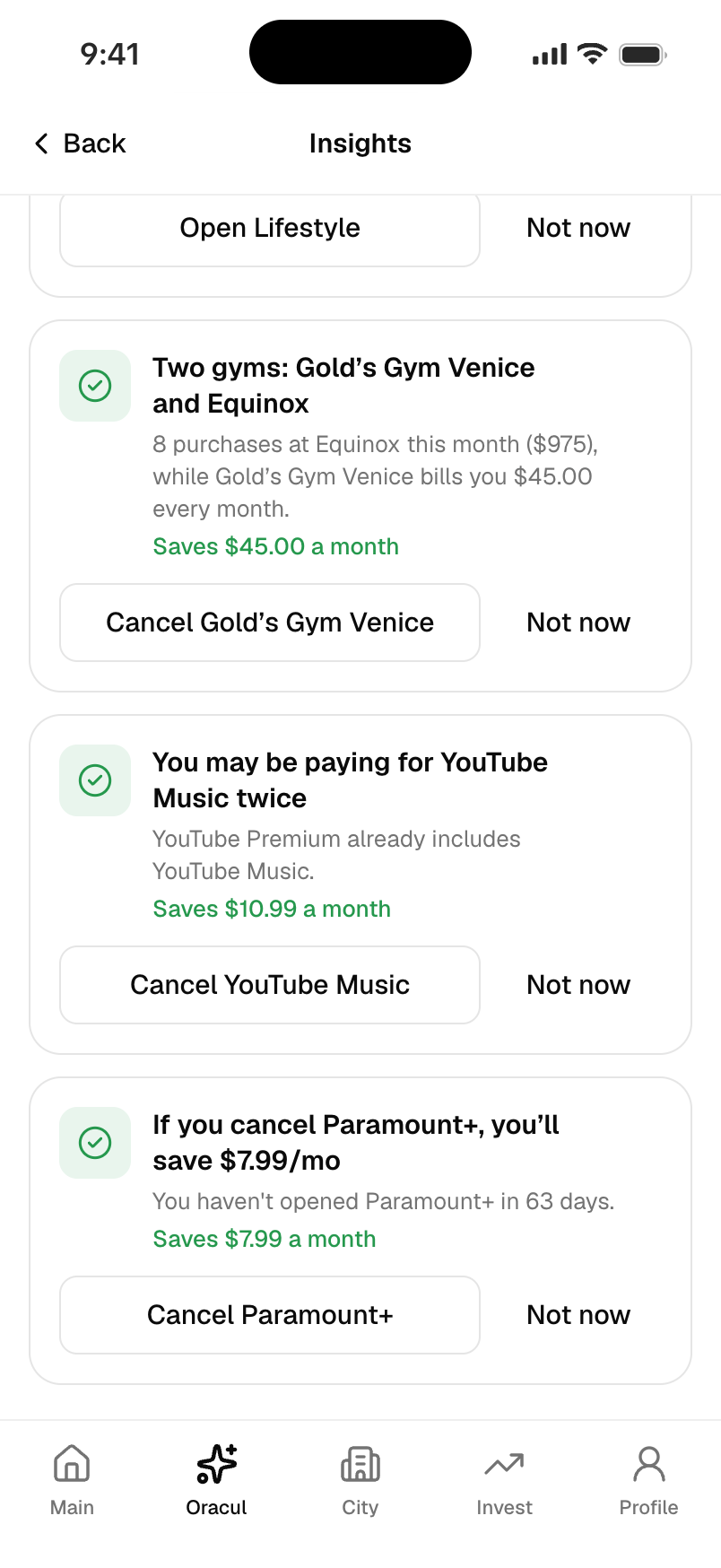
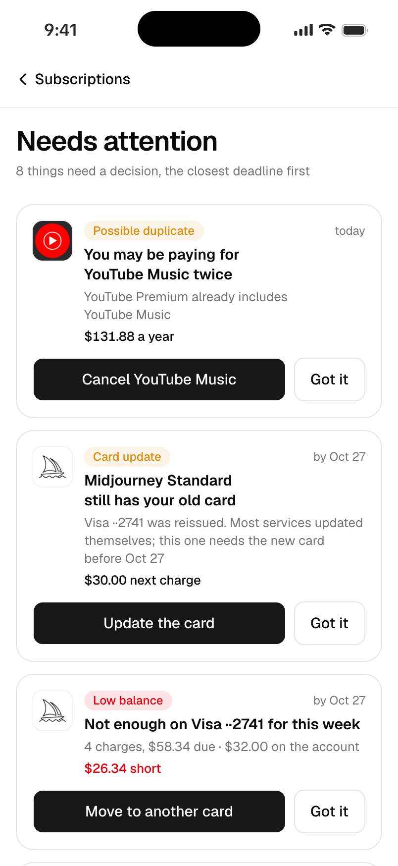
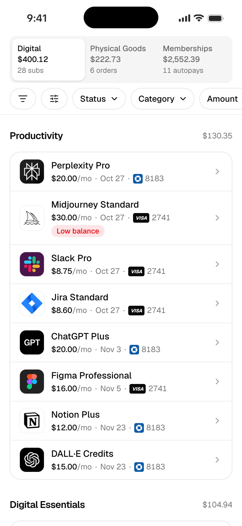
A subscription list alone does not tell you what needs doing. Needs attention brings forward duplicate payments, trials ending, price changes and payment problems, ordered by the nearest deadline.
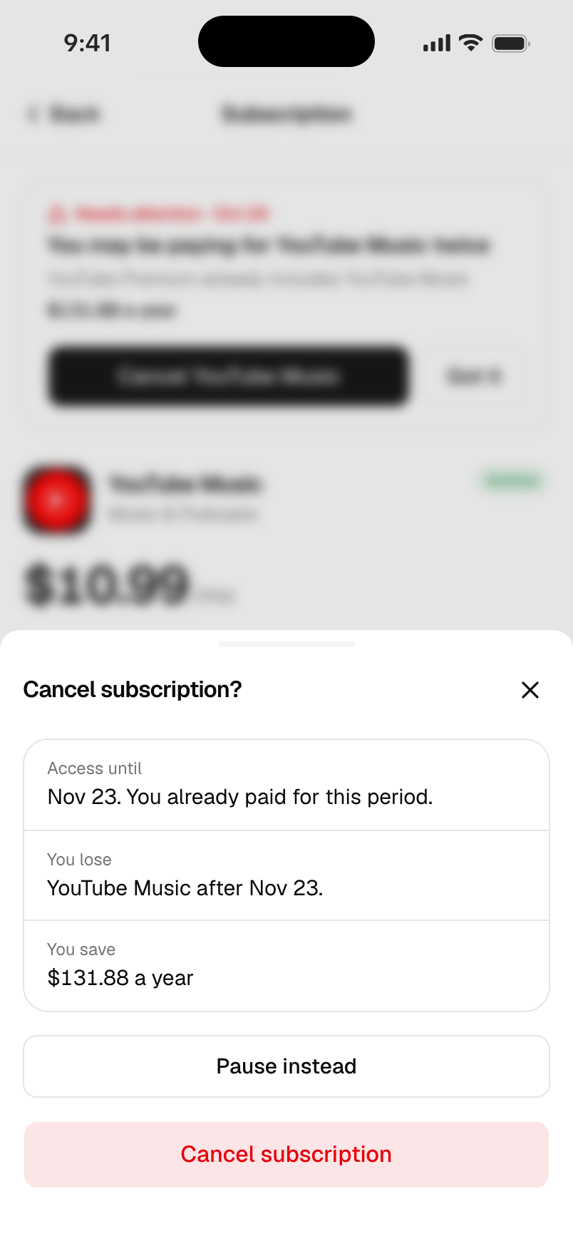
Before cancellation, the interface shows the cost, remaining access and what would be lost. Digital services, deliveries and memberships stay in separate groups, while the decision follows the same clear pattern.
04 / Learn
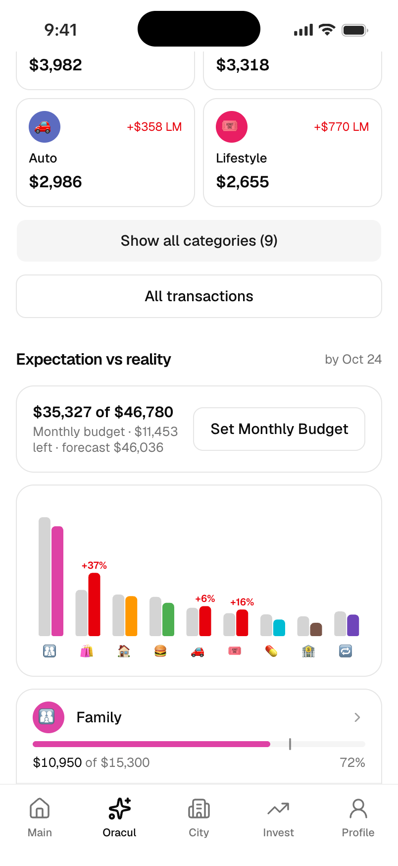
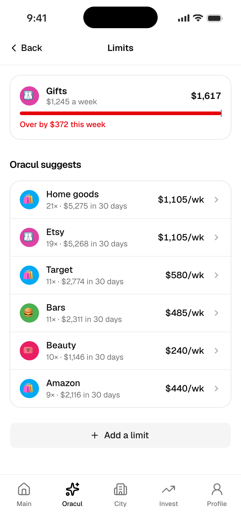
We put the budget and actual spending side by side for each category. This makes the difference visible without asking the person to compare two reports.
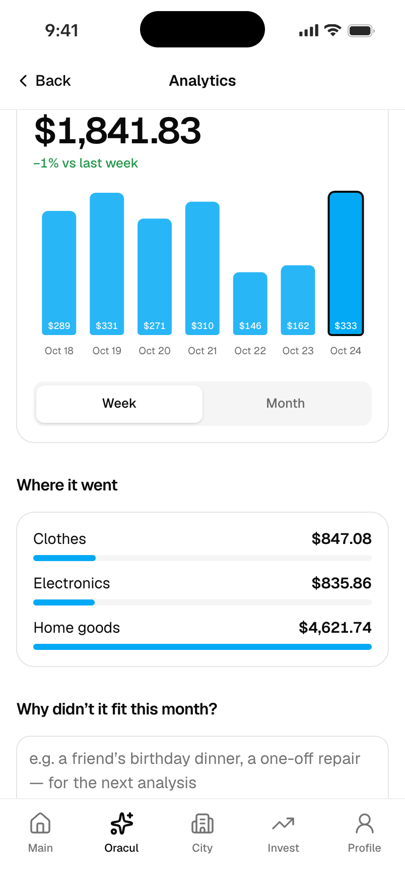
A note keeps the reason for an unusual month, while weekly or monthly limits give repeated spending a smaller boundary. Together they support a practical review: what changed, why it changed and what to adjust next.
05 / Plan ahead
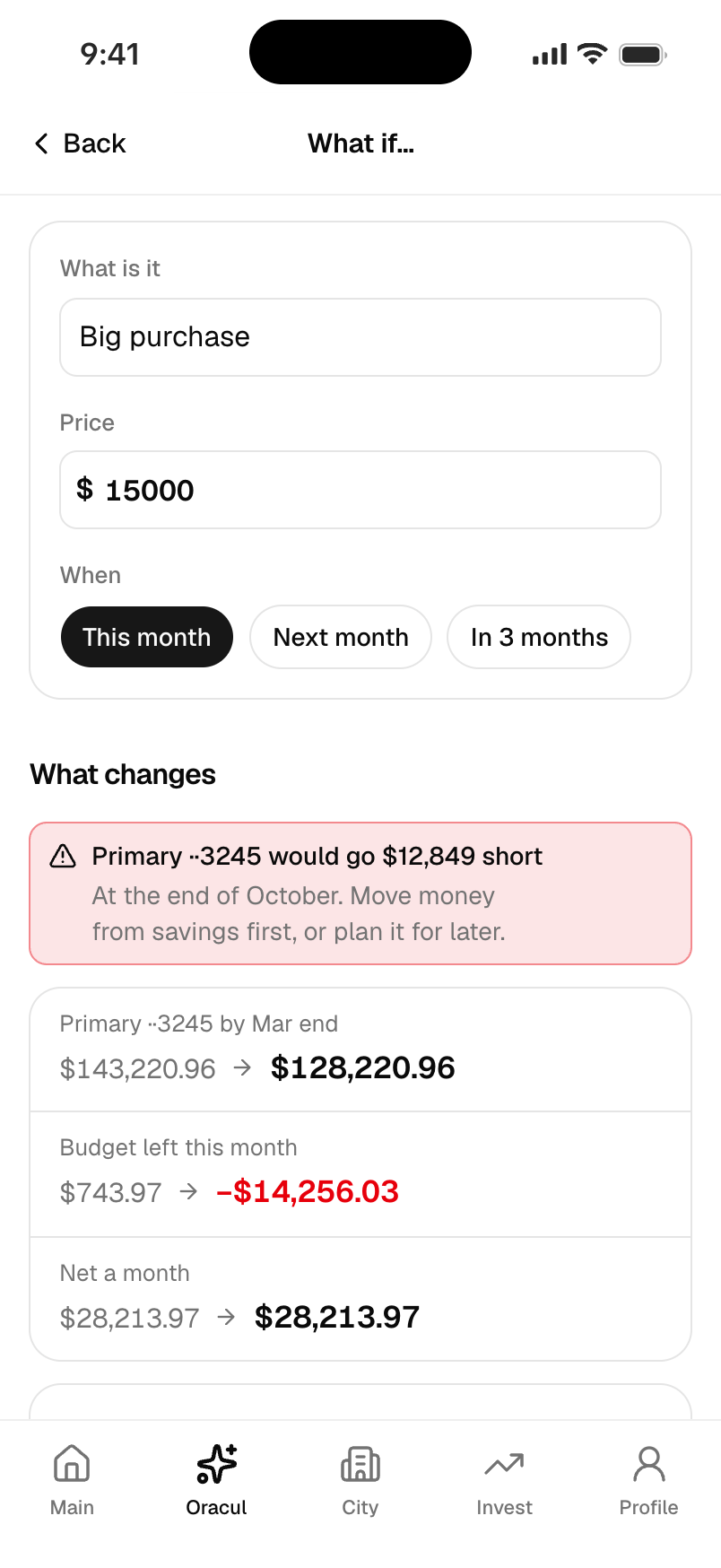
What if lets the person try a purchase, a loan, a new subscription or an income change against the sample finances. It puts the before and after side by side and calls out a shortfall before the person proceeds.
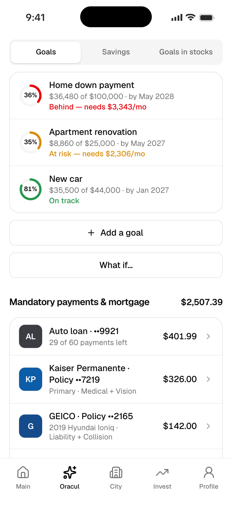
A scenario can be saved as a goal with a monthly contribution. The separate goals view shows progress on existing sample goals. The purpose is to make a choice easier to examine, without presenting a projection as a promise.
The result
© 2026 SKARR.PRO
Categories
Choose your language